← Back to Projects
Design System

Enterprise Design System

Designing a design system for patient and healthcare provider portals within a major pharmaceutical organization required balancing consistency, scalability, regulatory compliance, and accessibility. As part of a 4-person team, I cataloged components, addressed diverse user needs, and fostered collaboration to create a unified and adaptable framework for critical healthcare platforms.

Role Design System Lead
Tools Figma, Storybook, Zeroheight
Team 4 Designers
Enterprise Design System

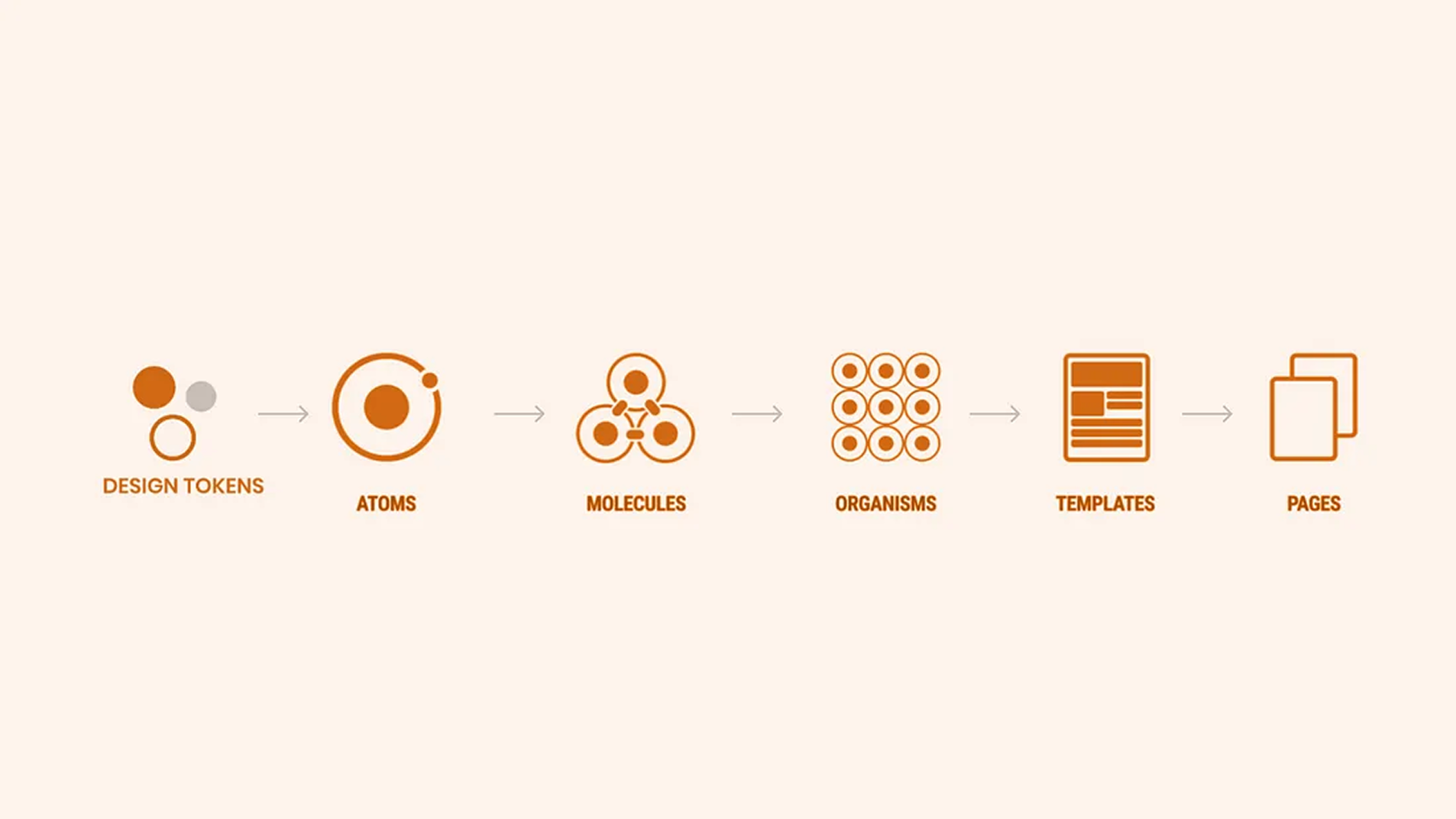
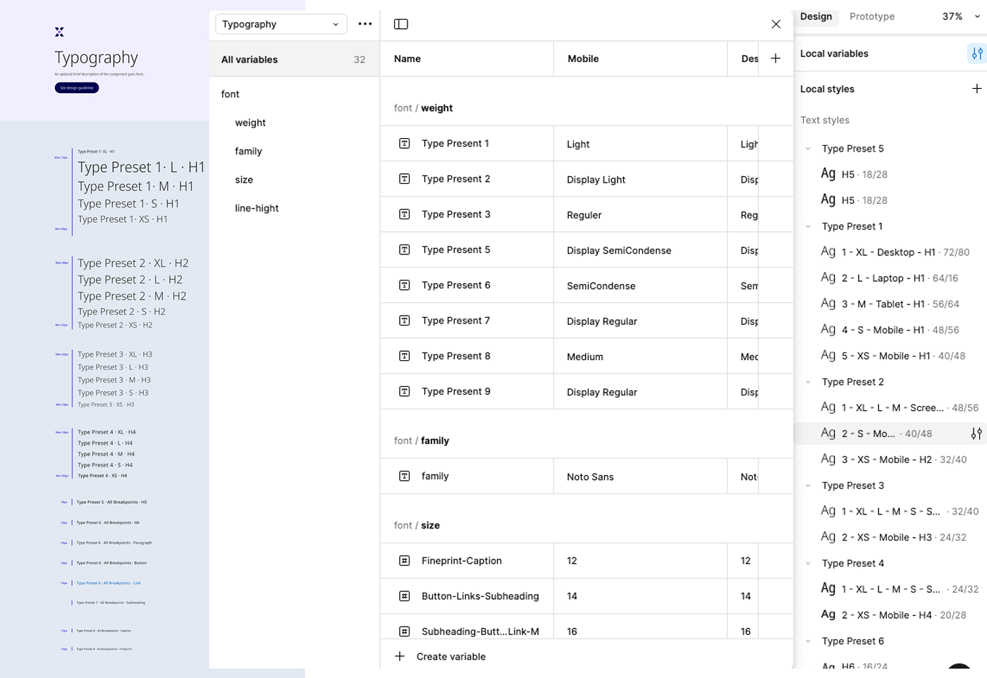
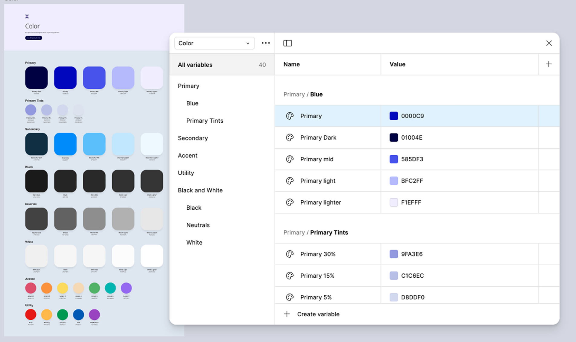
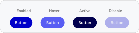
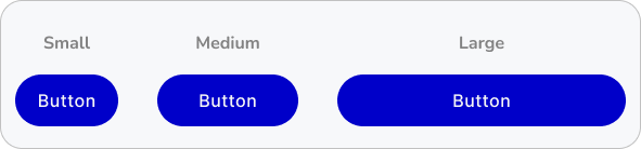
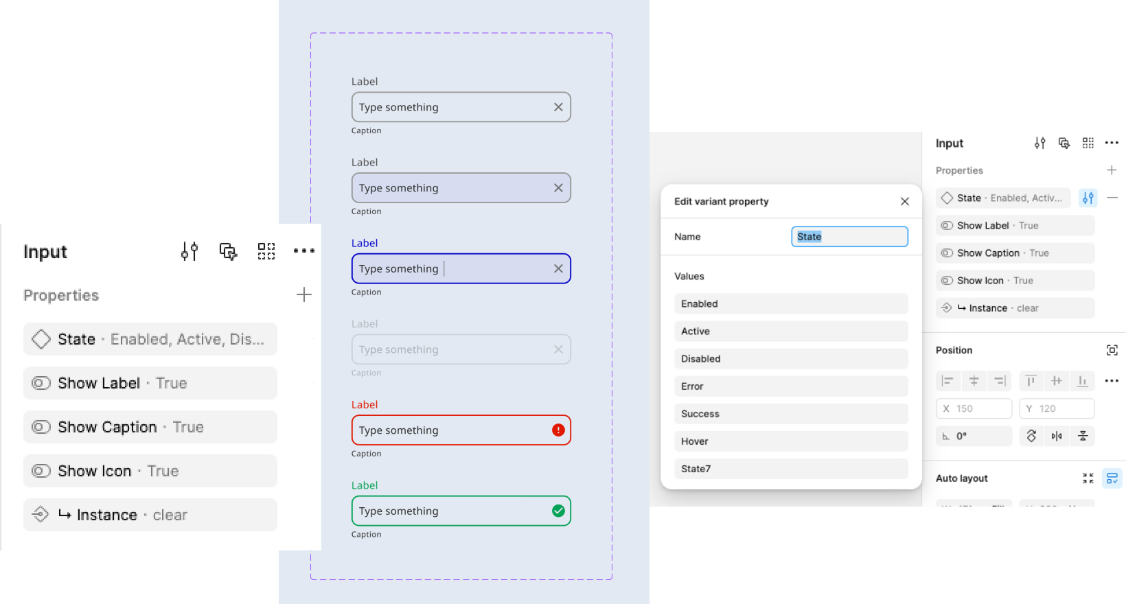
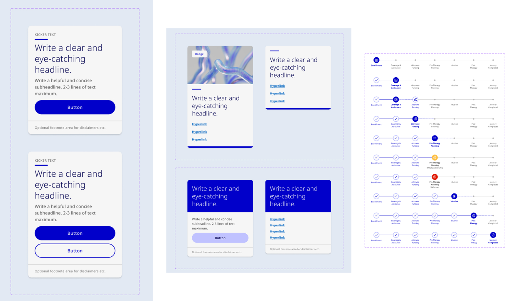
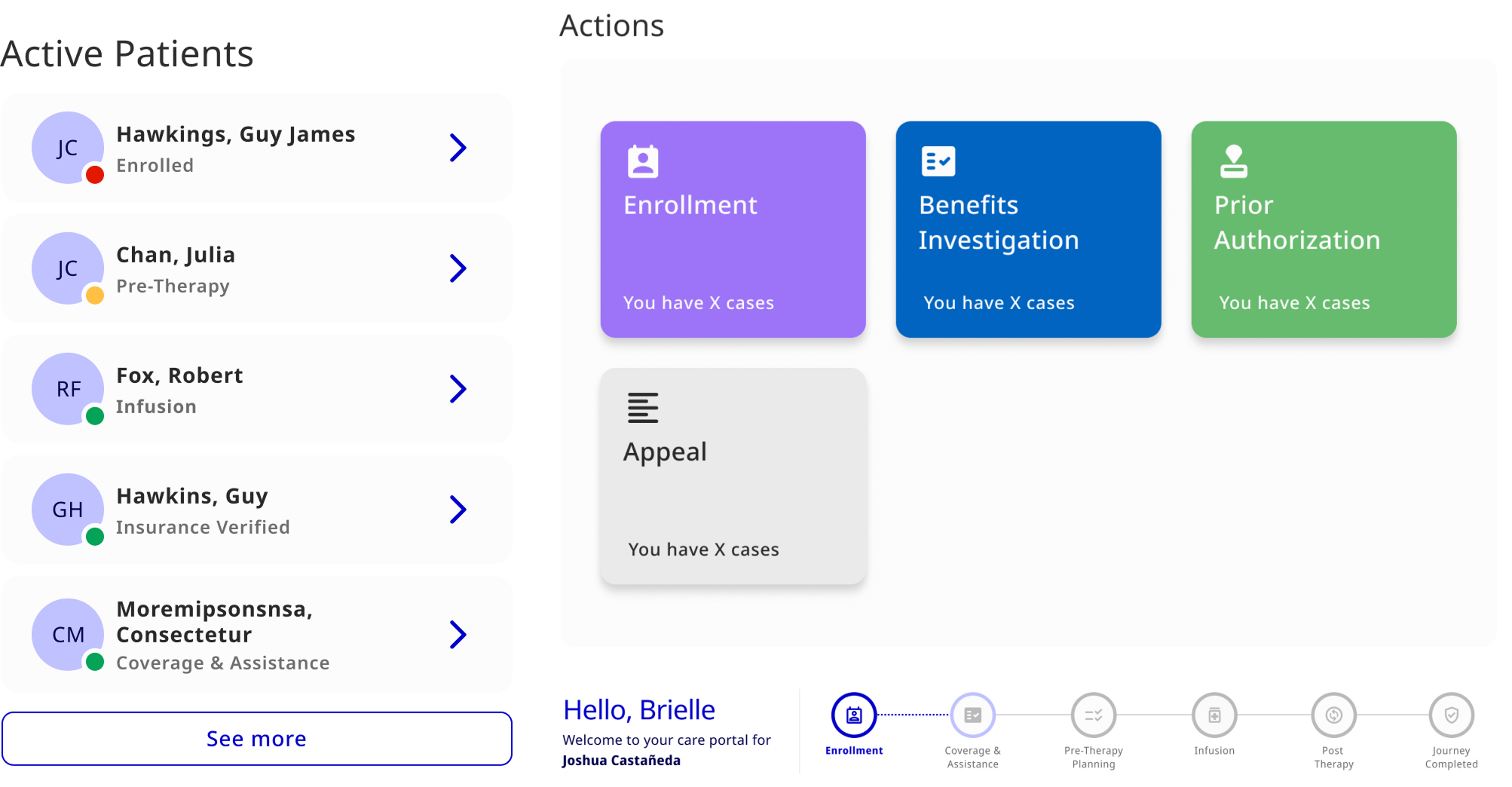
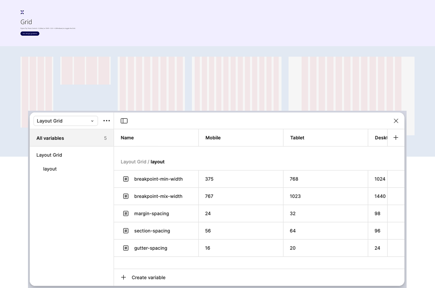
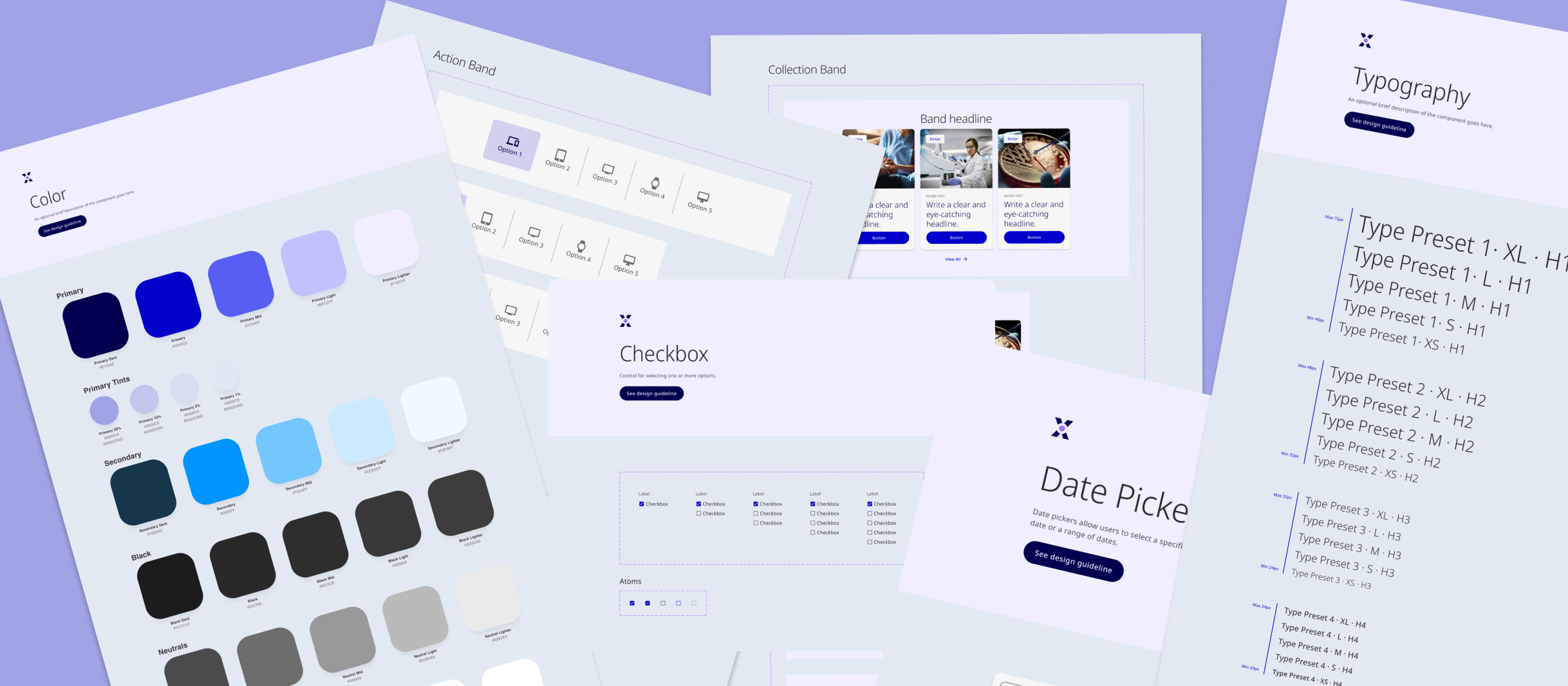
I was responsible for ensuring our design system enabled faster, more cohesive collaboration. When we began, we inherited an over-complicated and poorly documented set of Figma files that didn't align with the front-end implementation.

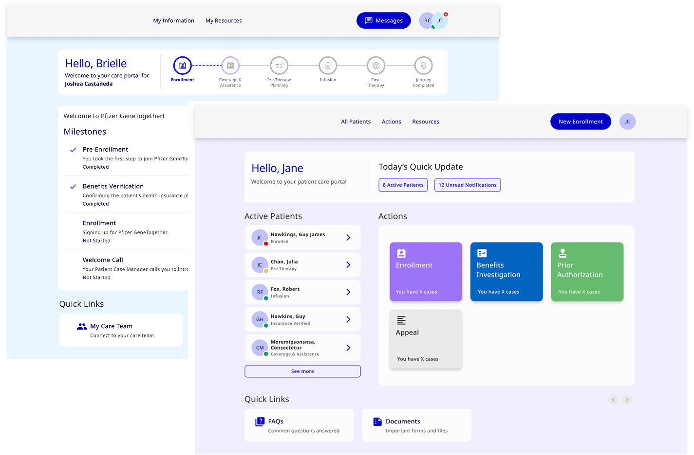
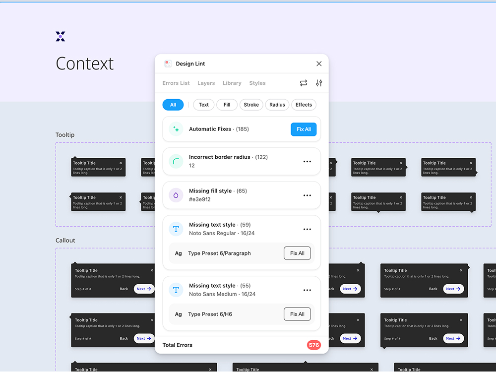
By the end, we had established clear documentation and introduced a structured process of critique and governance on the design side to evolve the system. Additionally, we initiated collaboration with engineering to make the design system a shared priority, ensuring alignment between design and development for the patient and HCP portals.

Atomic Design Methodology

To build the design system for the patient and HCP portals, we adopted the Atomic Design methodology to organize and structure our assets effectively. This approach allowed us to break down the system into smaller, reusable components while ensuring scalability and consistency across the portals.

To begin with, we started designing basic atoms of our design system like font, primary colors, icon set. Things got more interesting and tangible when we started combining these atoms together to form molecules like buttons, form fields, table cells etc.

We started with the smallest building blocks, such as colors, typography, icons, and spacing. These foundational elements formed the core design tokens that ensured consistency across all components. To manage these effectively, we leveraged variables in Figma to create a single source of truth for our design tokens.

Typography

Font styles, sizes, weights, and line heights were systematized as text variables, ensuring that all typography decisions followed a cohesive hierarchy and were easily reusable across components.

Colors

We defined a structured palette with primary, secondary, and neutral colors, along with semantic tokens like success, error, and warning.

We created a comprehensive set of button variants to ensure flexibility, consistency, and adaptability across the patient and HCP portals. Buttons are a critical element in the user interface, and our goal was to cover all possible use cases while adhering to accessibility and design standards.

Variants by Type

  • Primary Buttons: Used for the most important actions, such as "Submit" or "Next." These buttons stood out with bold styling to attract user attention.
  • Secondary Buttons: For less prominent actions, such as "Cancel" or "Learn More," styled to complement the primary buttons without overpowering them.
  • Links: For actions with minimal emphasis, such as "Back" or non-critical links, designed with subtle styling.

State Variants

Each button type was created with multiple interactive states:

  • Enabled (with clear outlines for accessibility compliance)
  • Hover State (slight change in color or elevation for interactivity)
  • Active State (pressed appearance for tactile feedback)
  • Disabled State (muted styling to indicate inactivity)

Size & Icon Variants

To ensure responsiveness across different layouts, we designed buttons in multiple sizes (Small, Medium, Large) and with icon options (Icon on Left, Icon on Right, Icon-Only).

We designed a versatile set of input field components to support various data entry needs across the patient and HCP portals. Each input field was created with multiple states—default, focused, active, error, success, and disabled—to ensure clear feedback and accessibility.

Molecules in our design system were created by combining atoms into functional, reusable components that served specific purposes within the patient and HCP portals. These medium-complexity components were designed to ensure consistency and efficiency across interfaces, providing building blocks for more complex organisms and templates.

Key Molecules Included

  • Form Groups: Label + Input Field: A foundational pairing with clear labeling, helper text, and validation messages.
  • Patient Journey Tracker: One of the key molecules designed to guide patients through critical steps in their healthcare journey.
  • Card Components: Modular cards featuring an image, title, description, and optional actions (e.g., "View Details," "Edit") to present information concisely and visually.
  • Notification Banners: A combination of icons, text, and optional action buttons for displaying success, error, warning, or informational messages.

Molecules gave us some building blocks to work with, and we were then able to combine them together to form organisms. We could then finally see the interface beginning to take shape.

Organisms in our design system were larger components made by combining smaller parts (molecules) to handle specific tasks or workflows. They were key building blocks for the portals, ensuring everything worked consistently and efficiently.

Key Organisms Included

  • Patient Journey Tracker with Actions: Guided users through steps with progress indicators and buttons for the next actions.
  • Navigation Bar: Included links, a message button, and user icons to help users easily access important sections, view messages, and manage their profiles.
  • Dashboard: Displayed key information such as the active patient list, actions (Enrollment, Benefits Investigation, Prior Authorization, and Appeals), and quick links for easy access to essential tasks.

Templates were pre-structured layouts that combined components to define the overall structure of key pages. They ensured consistent placement of elements like navigation, content, and actions.

Since layout grids define the arrangement of elements on templates, we applied the grid system to ensure consistency in template structure. It explained how the grid layout adapts to various screen sizes, ensuring a responsive, cohesive experience.

Pages were the final, content-filled version of the templates. Once the structure was defined, real content and data were populated into the templates to create live, user-ready pages. These pages were the actual user interfaces that patients and healthcare professionals interacted with.

Examples

  • Patient Dashboard: Organized patient info, tasks, and actions. Patient journey tracker.
  • HCP Dashboard: Displayed key information such as the active patient list, actions (Enrollment, Benefits Investigation, Prior Authorization, and Appeals), and quick links for easy access to essential tasks.

The design system transformed how the patient and HCP portals were designed and developed, delivering significant improvements in consistency, efficiency, and collaboration:

  • Improved Design Consistency: Established a unified visual language across portals, ensuring a seamless user experience for patients and HCPs globally.
  • Faster Development Cycles: Streamlined the design-to-development handoff, reducing production time for new features.
  • Enhanced Collaboration: Fostered a shared ownership model between design and engineering, breaking down silos and improving cross-functional communication.
  • Regulatory and Accessibility Compliance: Built components and patterns that adhered to strict healthcare regulations and accessibility standards, increasing user trust and satisfaction.
  • Scalability: Created a robust system capable of scaling with evolving business needs and accommodating localized variations across regions.

Reimagining the Design System with AI

If I were to rebuild this today, I'd introduce AI to make the system adaptive and intelligent.

AI could scan Figma files for redundant components, generate documentation automatically, and ensure accessibility compliance in real time.

The goal isn't automation for speed—it's intelligence for quality and learning.

Throughout the design system process, I learned the importance of collaboration between design, development, and product teams to ensure a seamless, functional system. Prioritizing scalability and flexibility allowed the system to grow with evolving needs.

I also realized the value of clear documentation and regular iteration to maintain consistency and keep the system relevant. Accessibility and regulatory compliance were essential, and above all, designing with a user-centered approach ensured the system met the needs of both patients and healthcare professionals.

These lessons have shaped my growth as a designer and will guide future projects.

Next Project

Pfizer GTX Website