The Challenge
Users, including patients and healthcare professionals, need a seamless and intuitive experience when navigating from unauthenticated pages to their respective portals.To design and implement UI/UX for the Pfizer GeneTogether website's unauthenticated pages, ensuring that these pages effectively serve as a clear and informative gateway to the patient and healthcare provider portals. The goal is to provide users with easy access to essential information and resources before logging in, thereby enhancing their overall experience and facilitating smooth navigation to the specialized portals.:
Hypothesis
"By creating role-based navigation pathways and simplifying complex medical information through visual storytelling, we can significantly improve user engagement, reduce support calls, and increase portal registration rates while maintaining regulatory compliance."
Key Assumptions
- Users will engage more with visual explanations than text-heavy content
- Clear role identification (patient/HCP) at entry will reduce navigation confusion
- Trust indicators and transparent information will increase portal sign-ups
- Mobile-first approach will improve accessibility for caregivers
Research
User Research
We conducted extensive user research including stakeholder interviews, user surveys, competitive analysis, and usability testing of the existing platform.
of users wanted easier access to educational resources
struggled with medical terminology
preferred visual explanations over text-heavy content
Key Insights
- Users need clear pathways based on their role (patient vs. HCP)
- Trust indicators are crucial in healthcare websites
- Mobile accessibility is essential for on-the-go access
- Compliance with healthcare regulations must be seamless
Sitemap
Information Architecture
Based on research findings, I restructured the site's information architecture to create clear user journeys for different audience segments. The sitemap was designed to ensure intuitive navigation and logical content grouping.
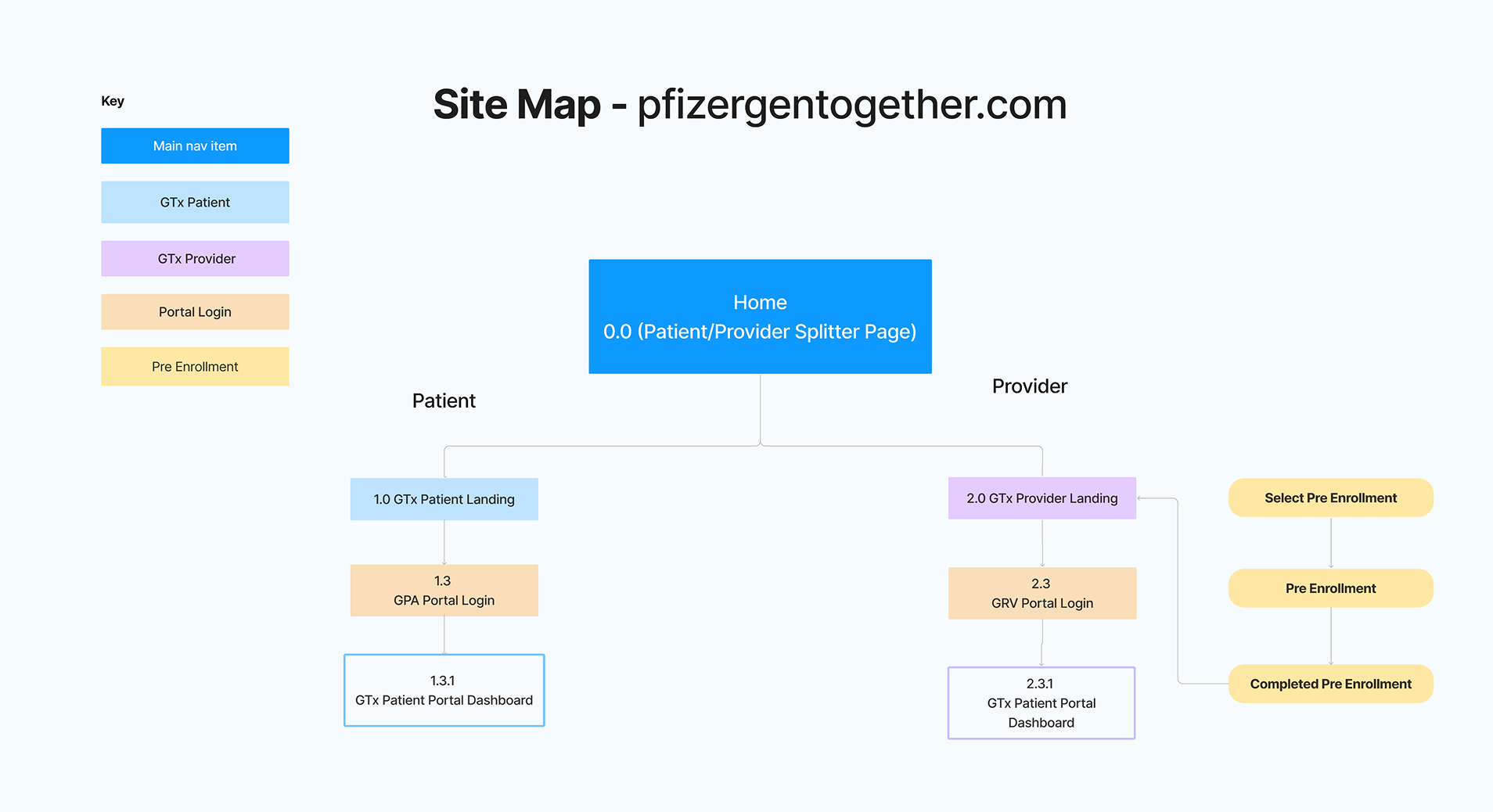
This architecture separates content for patients and healthcare providers while maintaining easy access to shared resources like FAQs and contact information.
Wireframing
Low-Fidelity Wireframes
Through iterative wireframing sessions, I explored multiple layout options and navigation patterns. These wireframes focused on content hierarchy, user flow, and key interaction points.
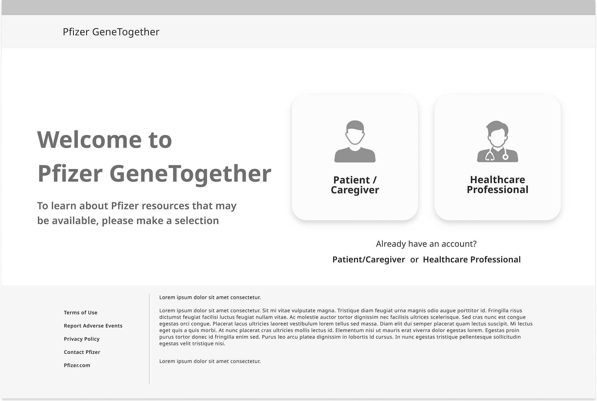
Key Wireframing Decisions
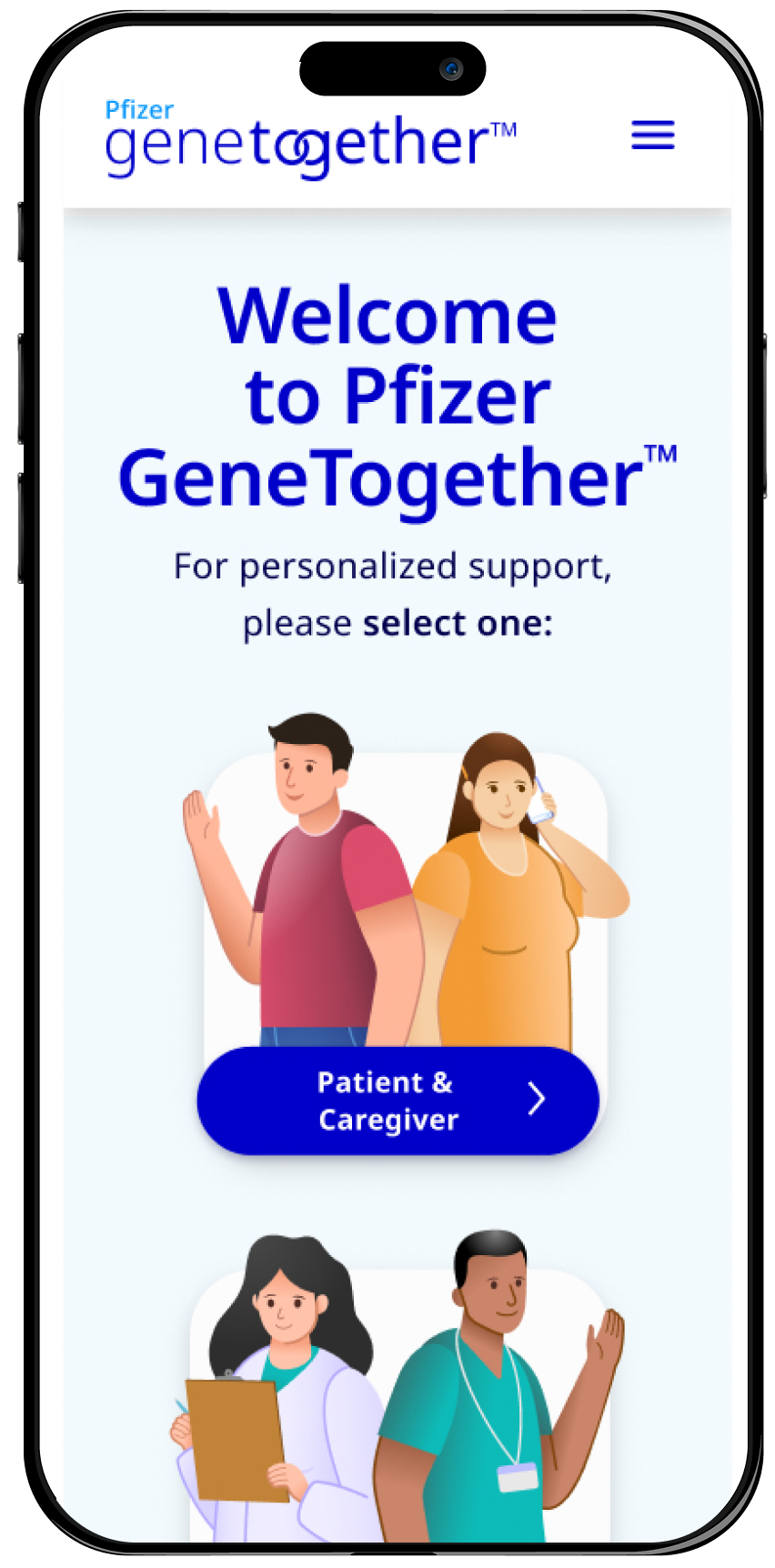
- Role selection prominently placed on homepage for immediate user segmentation
- Educational content organized in digestible sections with visual anchors
- Clear call-to-actions for portal registration throughout the journey
- Sticky navigation for easy access to key sections
Design Components
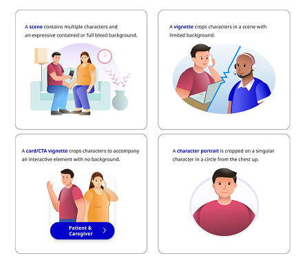
Component Library
I developed a comprehensive component library that follows Pfizer's brand guidelines while introducing a warmer, more approachable aesthetic suitable for patient-facing content. Each component was designed with accessibility in mind.
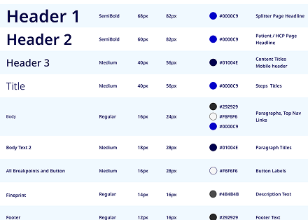
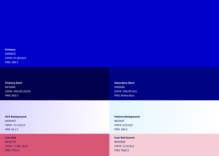
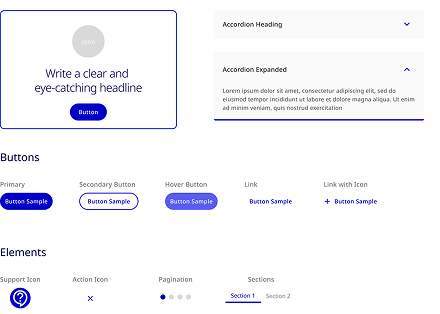
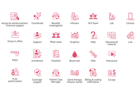
Design Principles
- WCAG 2.1 AA compliant color contrast and typography
- Consistent spacing and visual rhythm across all components
- Reusable patterns for scalability across portal experiences
- Responsive design tokens for seamless mobile adaptation
Iteration & Refinement
Usability Testing
Interactive prototypes were tested with patients of varying ages and abilities. Multiple rounds of usability testing helped refine the interface for maximum usability.
rounds of usability testing conducted
participants across patient and HCP groups
design iterations based on feedback
Key Refinements
- Simplified medical terminology after testing revealed comprehension issues
- Increased button sizes and touch targets for better mobile usability
- Added progress indicators to multi-step forms
- Enhanced visual hierarchy based on eye-tracking insights
- Improved error messages and form validation feedback
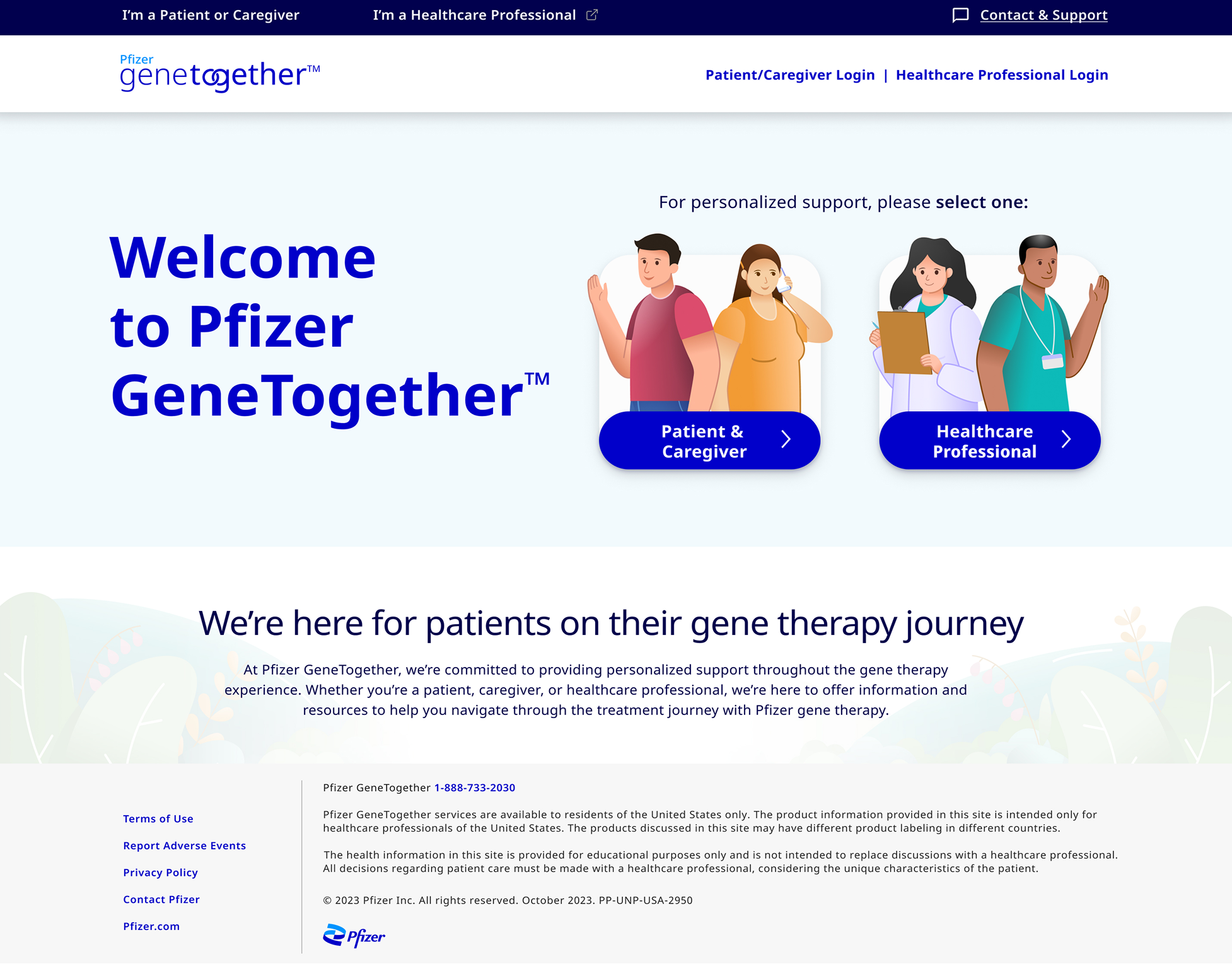
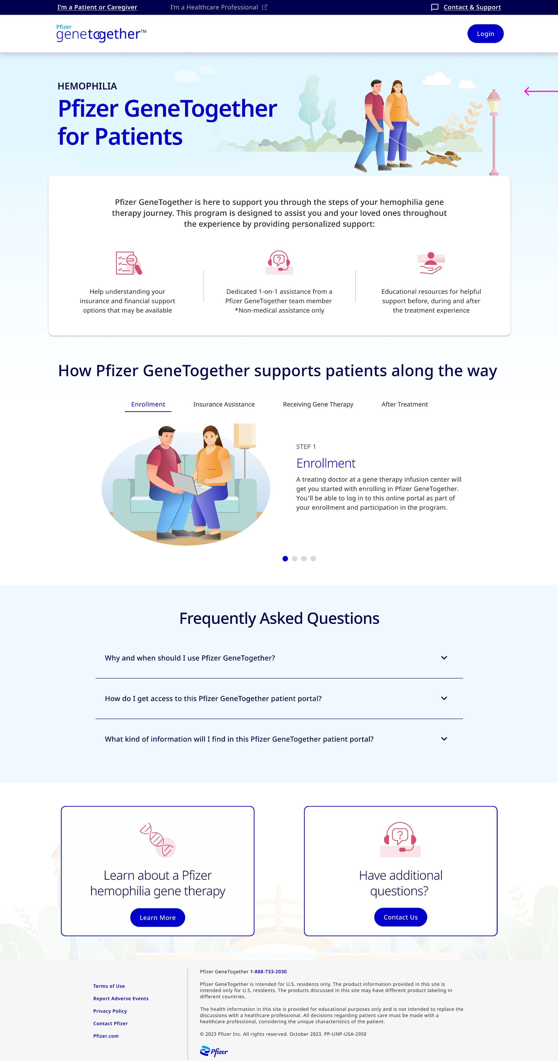
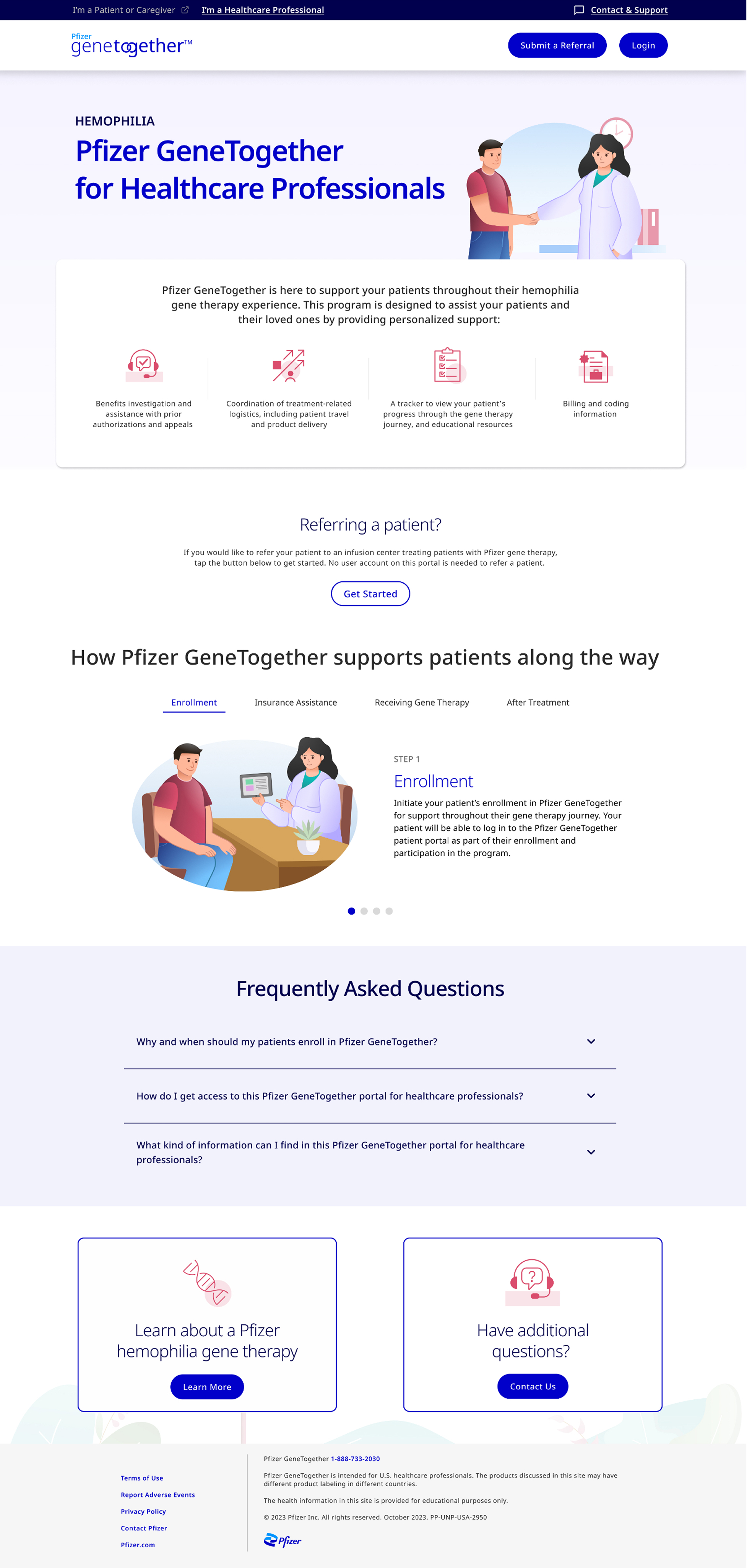
Final Design
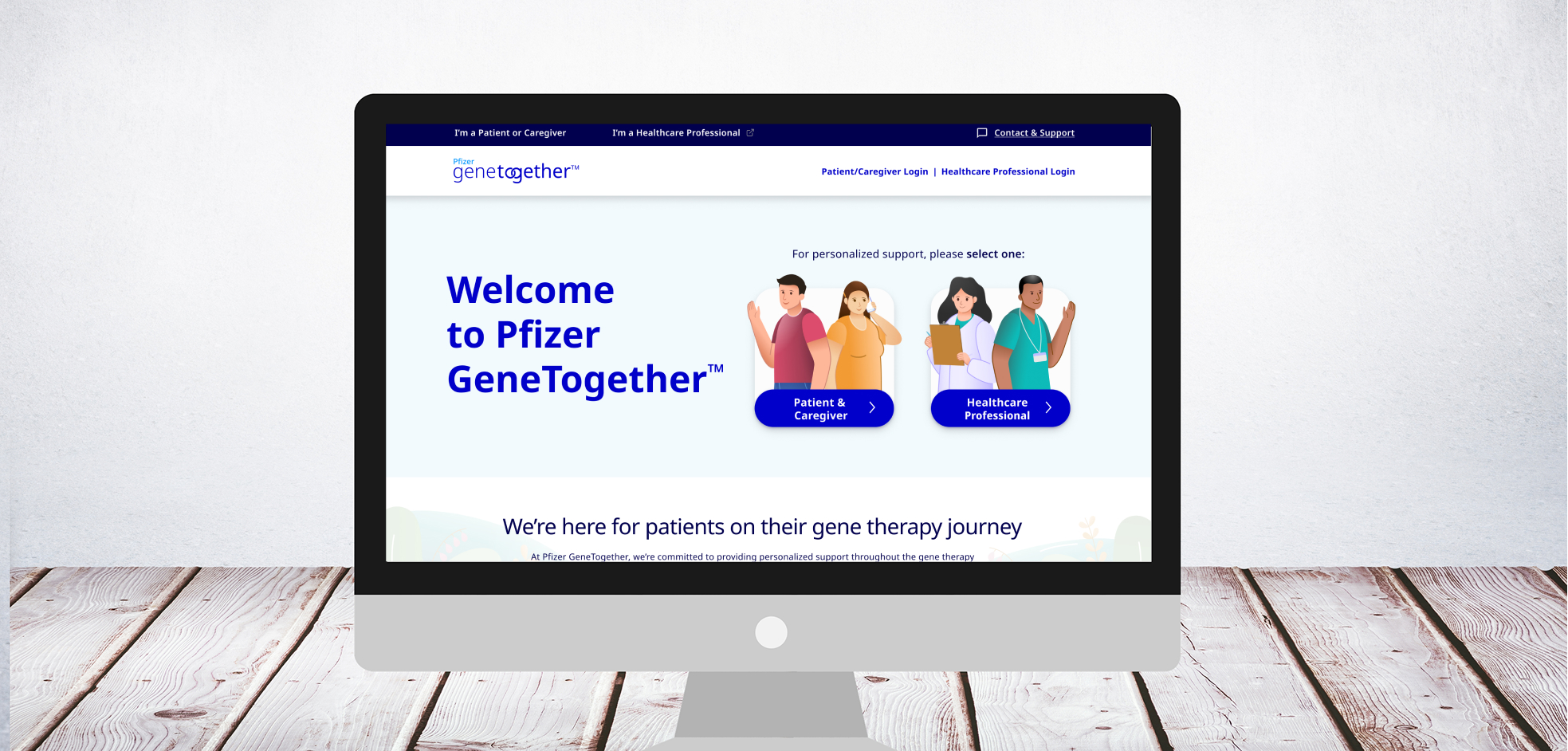
Desktop Experience
The final design creates a welcoming, trustworthy experience that guides users through their healthcare journey with clarity and confidence.
Mobile Experience
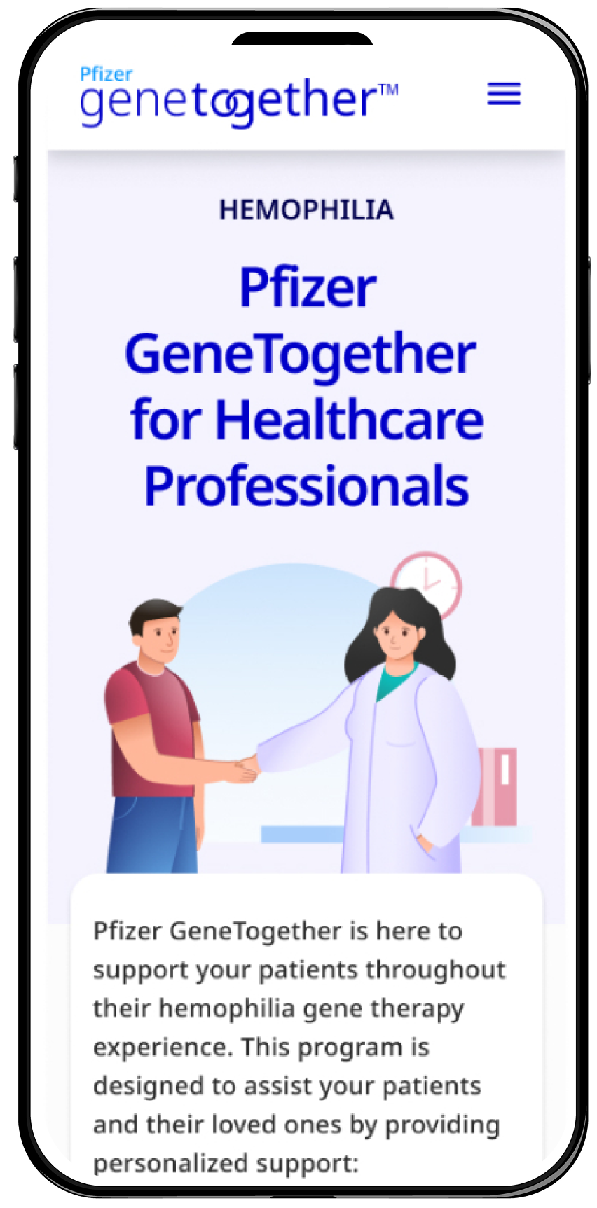
The mobile design prioritizes quick access to essential information and seamless navigation for users on-the-go.
Results & Impact
Measurable Outcomes
Increase in user engagement
Reduction in support calls
Improvement in portal registration
Additional Impact
- Average session duration increased by 65%
- Mobile traffic engagement improved by 78%
- User satisfaction scores rose from 3.2 to 4.6 out of 5
- Time to find information reduced by 45%
- Accessibility audit passed with WCAG 2.1 AA compliance
Stakeholder Feedback
"The new website has transformed how our patients interact with our gene therapy resources. The clear navigation and accessible content have made a real difference in their healthcare journey." - Pfizer Product Manager
Conclusion
Key Learnings
This project reinforced the importance of empathetic design in healthcare. By putting users at the center of the design process and simplifying complex information, we created an experience that truly serves patient needs while meeting business objectives.
- User research is invaluable for understanding healthcare anxieties
- Visual communication transcends medical jargon barriers
- Accessibility benefits all users, not just those with disabilities
- Iterative testing catches issues before launch
- Collaboration with compliance teams ensures regulatory success
What I Would Do Differently
If I were to approach this project again, I would incorporate more caregiver personas earlier in the research phase and explore additional multilingual support options to reach a broader patient population.
Next Steps
The success of the unauthenticated experience laid the groundwork for redesigning the authenticated patient portal, which was the next phase of this project.