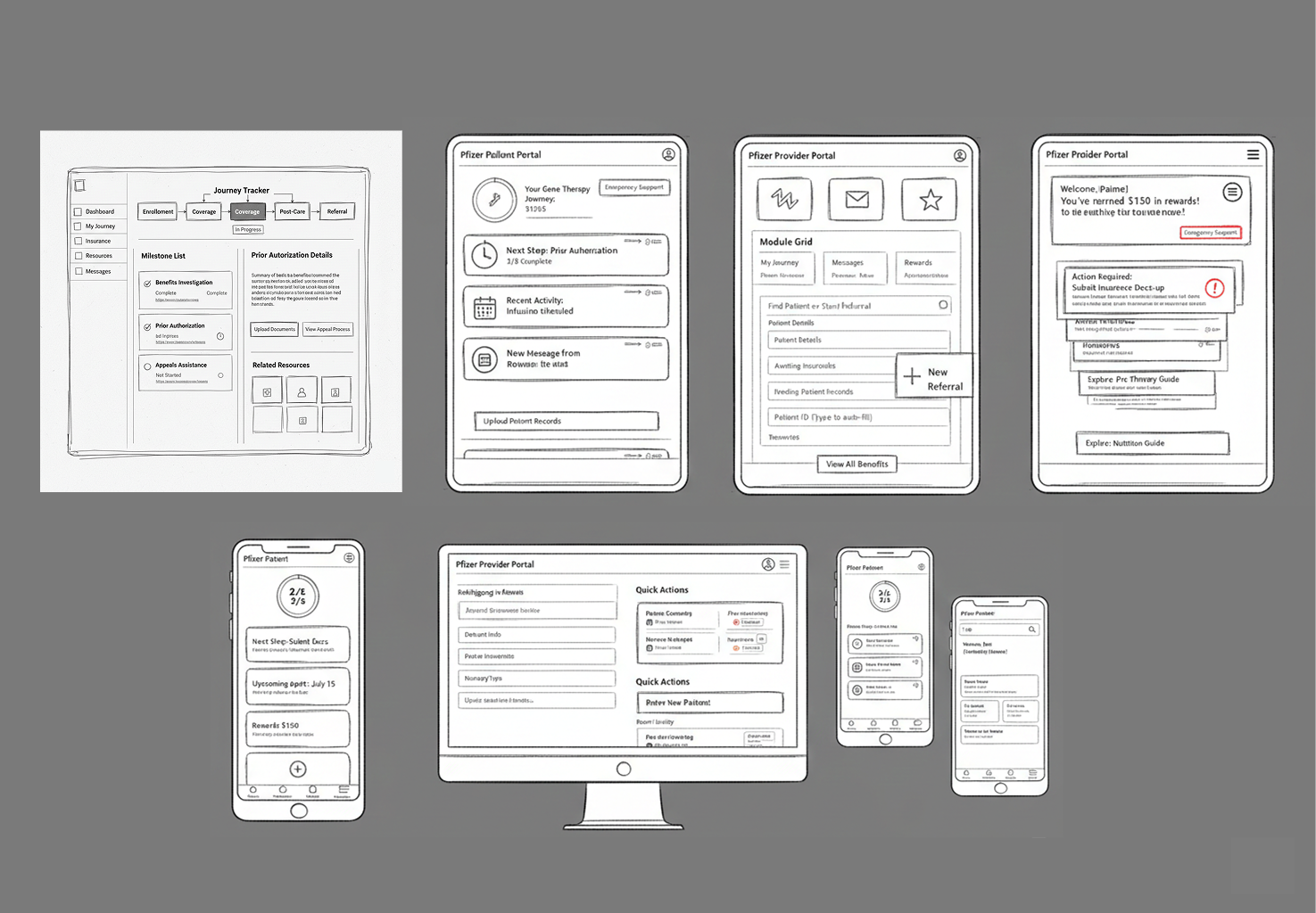
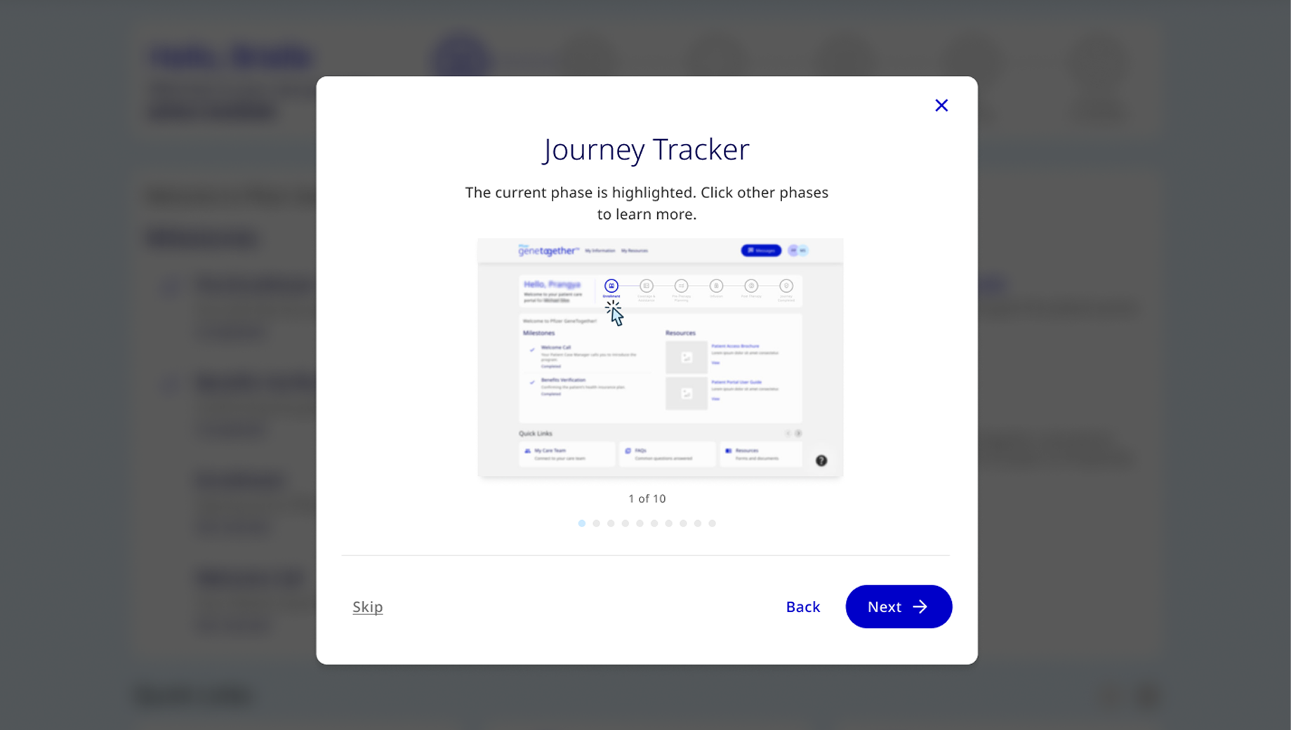
Usability Testing
Interactive prototypes were tested with patients of varying ages and abilities, as well as healthcare professionals. Multiple rounds of usability testing helped refine the interface for maximum usability.
3
rounds of usability testing conducted
24
participants across patient and HCP groups
35
design iterations based on feedback
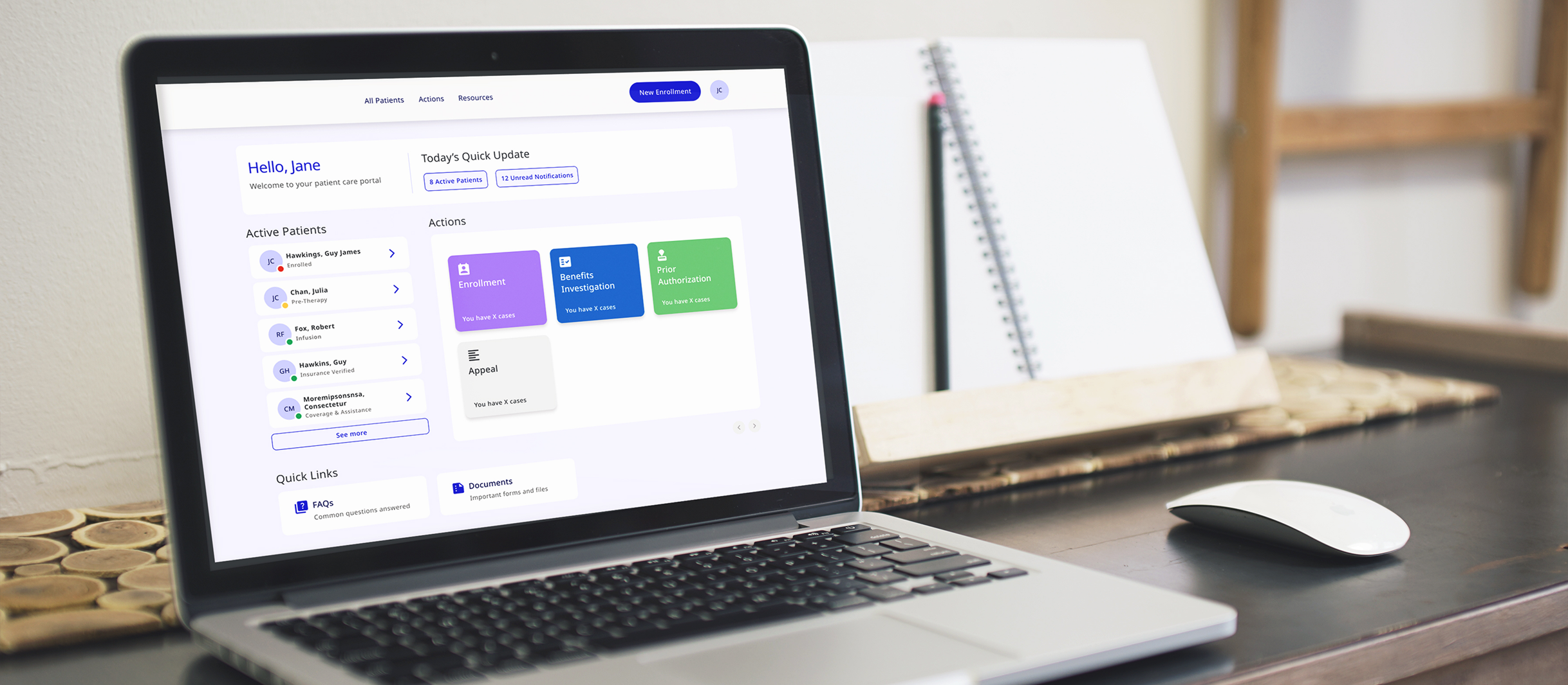
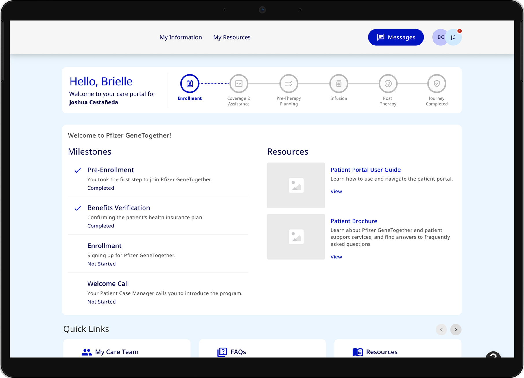
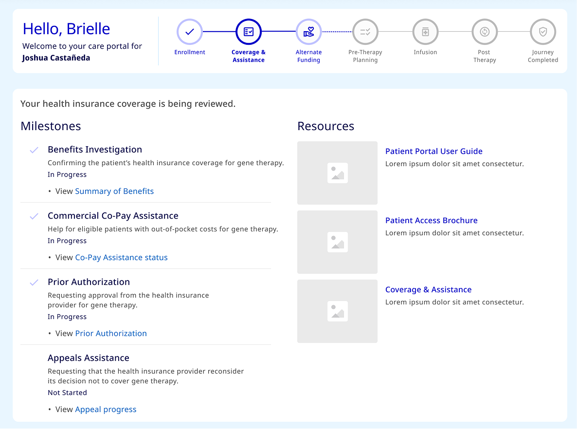
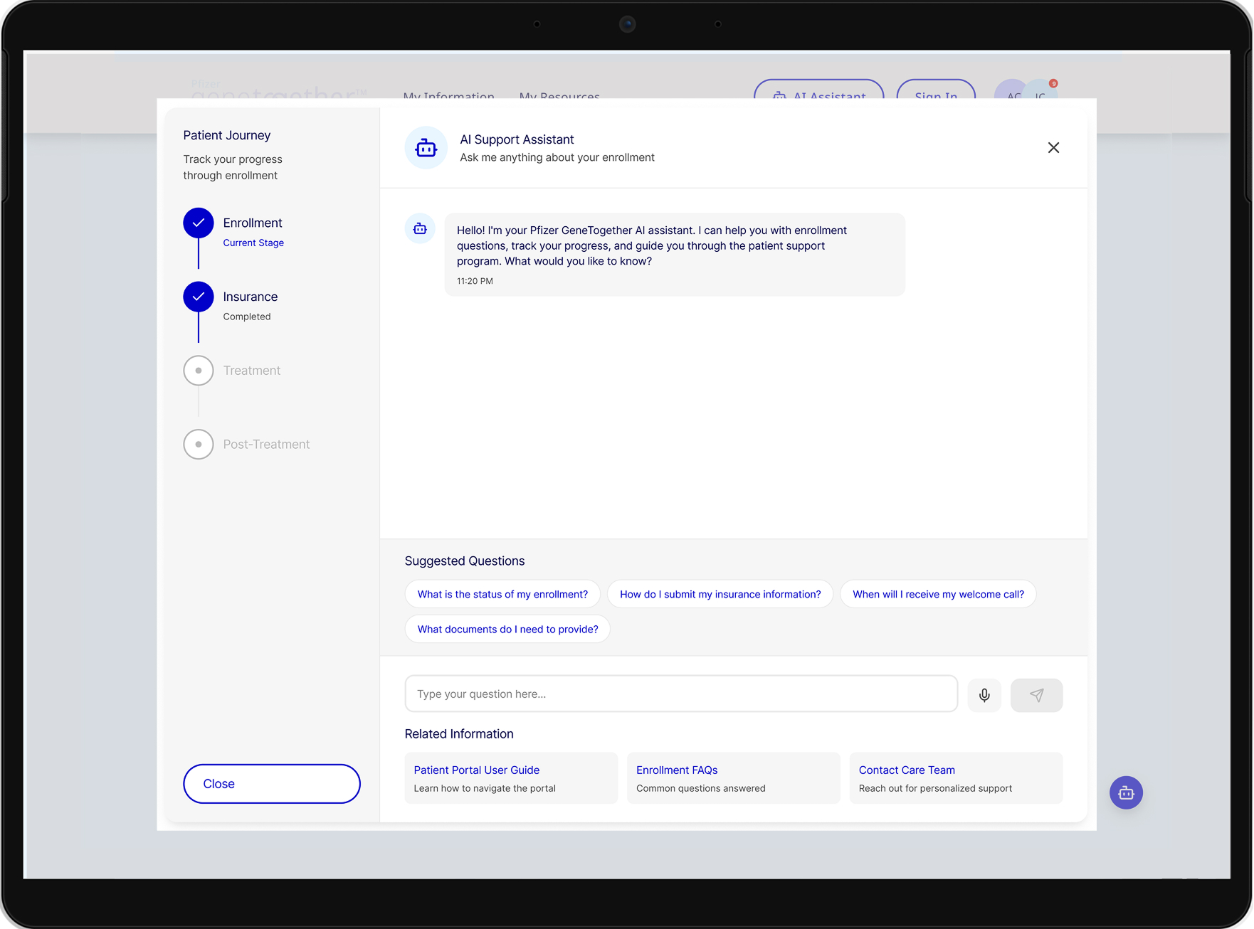
Before vs. After: A Turning Point
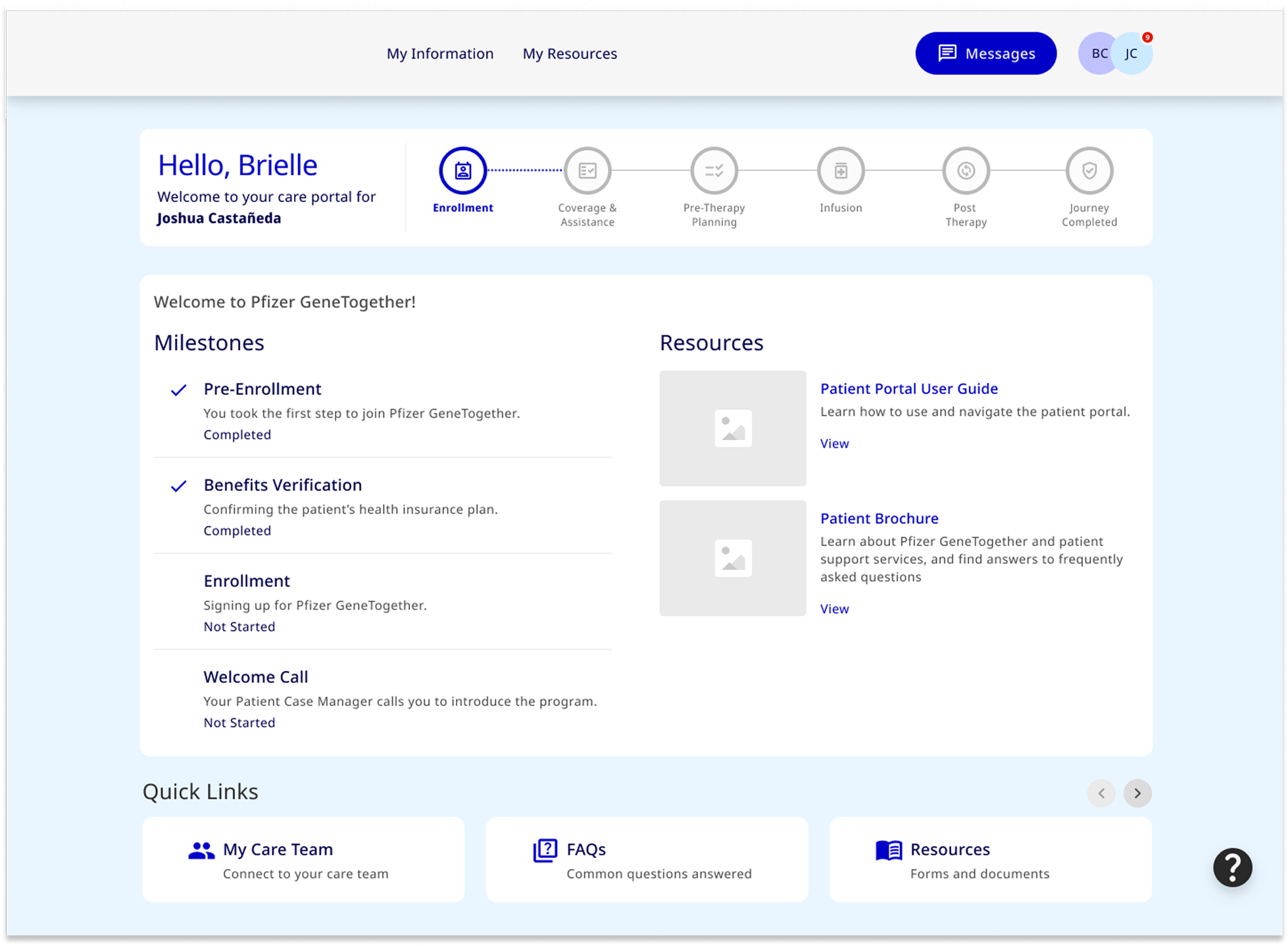
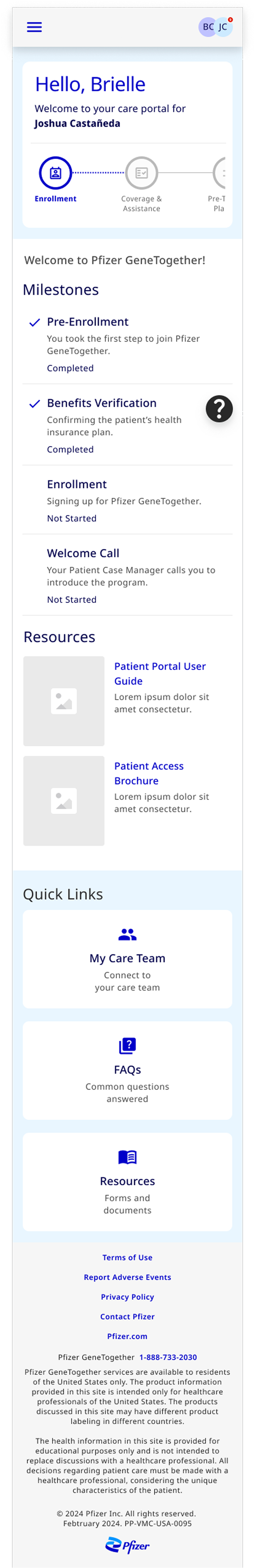
I want to highlight a specific turning point in the project regarding the Coverage & Assistance screen. This is the version I finalized after our second round of user testing.
Before
Initially, we had a standard, linear progress bar and a simple 'Under Review' status. During testing, patients told us this was their 'darkest hour.' They felt like their treatment was in a 'black hole' because they couldn't see the specific hurdles remaining.
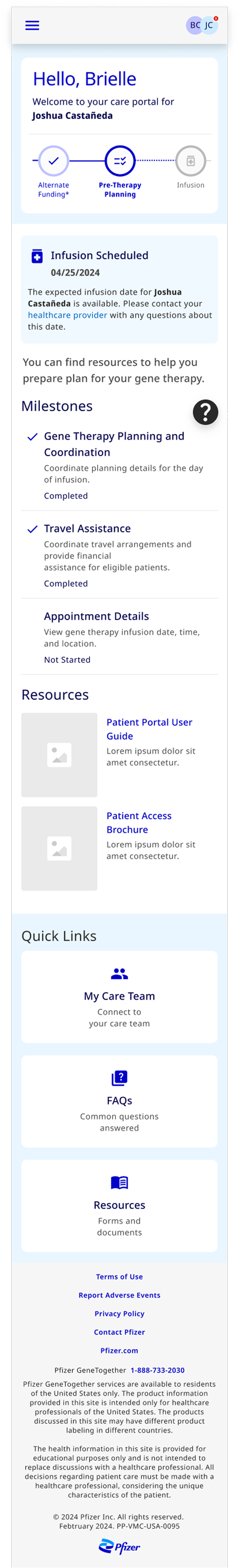
After
Based on user feedback, I overhauled the layout to move from 'Status' to 'Transparency':
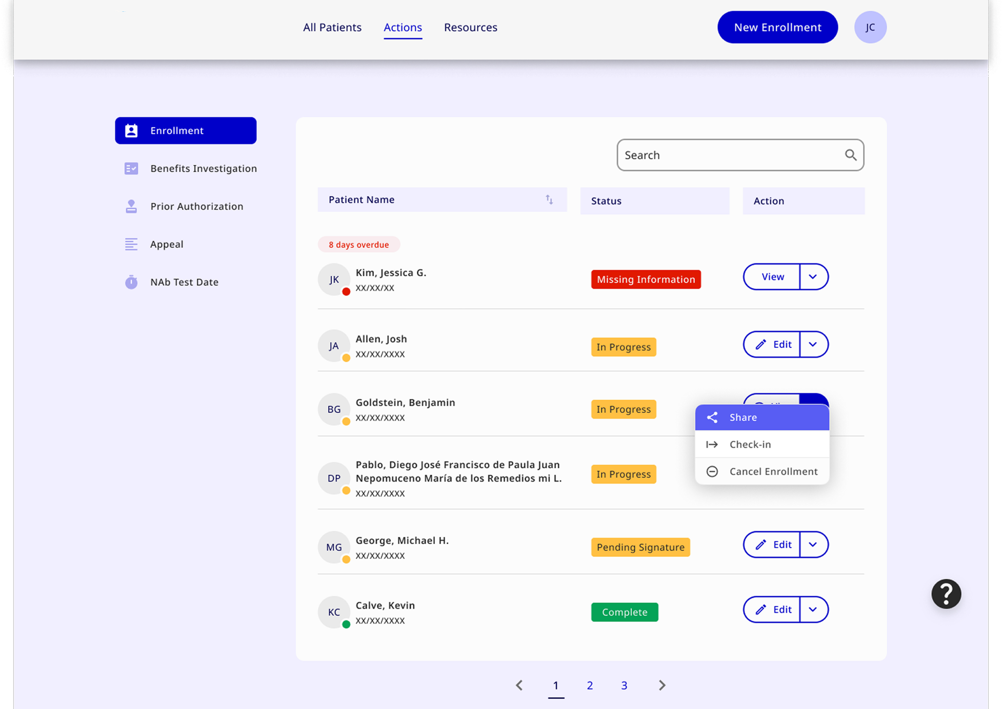
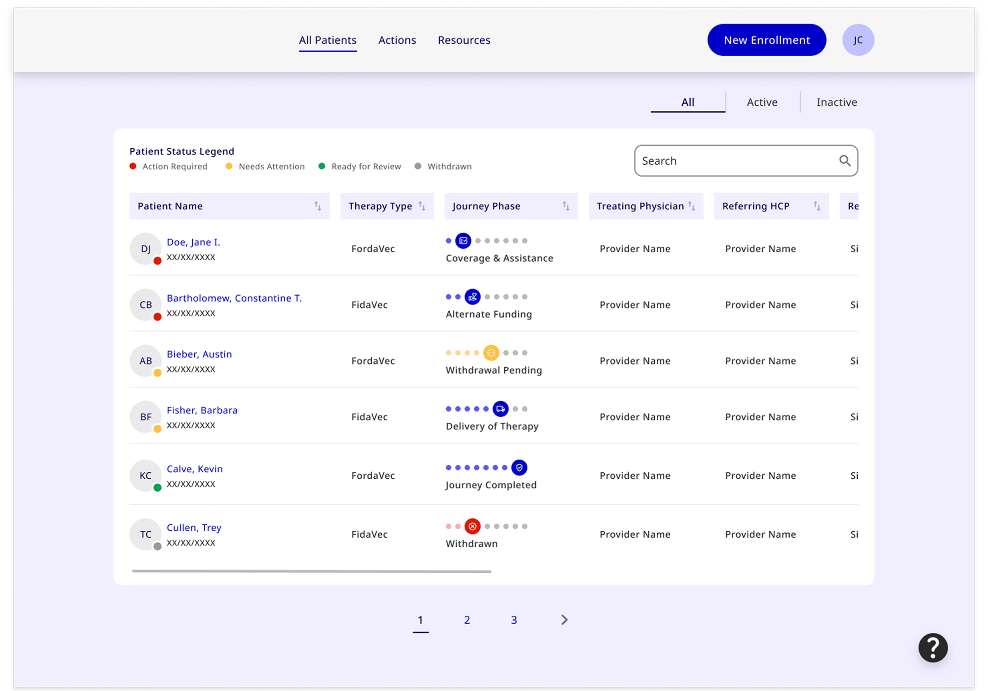
- Granular Milestones: Broke down the single 'Under Review' status into four specific sub-tasks: Benefits Investigation, Co-Pay Assistance, Prior Authorization, and Appeals.
- Contextual Documentation: Added direct links under each milestone so the information is available exactly when they need it.
The Result
This iteration was the key factor in reducing our abandonment rate by 60% and improving user satisfaction to 4.8/5. It proved that in healthcare, clarity isn't just a design choice—it's a form of patient care.
Key Refinements
- Simplified insurance claim submission process
- Increased button sizes and touch targets for better accessibility
- Added progress indicators to multi-step enrollment forms
- Enhanced visual hierarchy based on user feedback