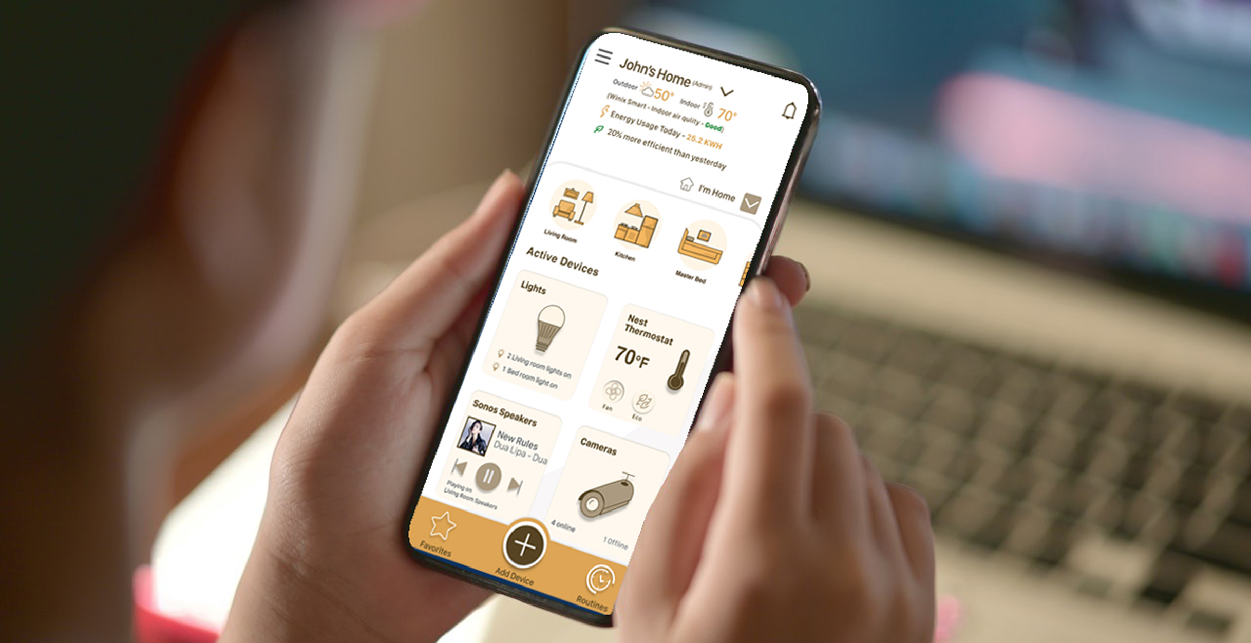
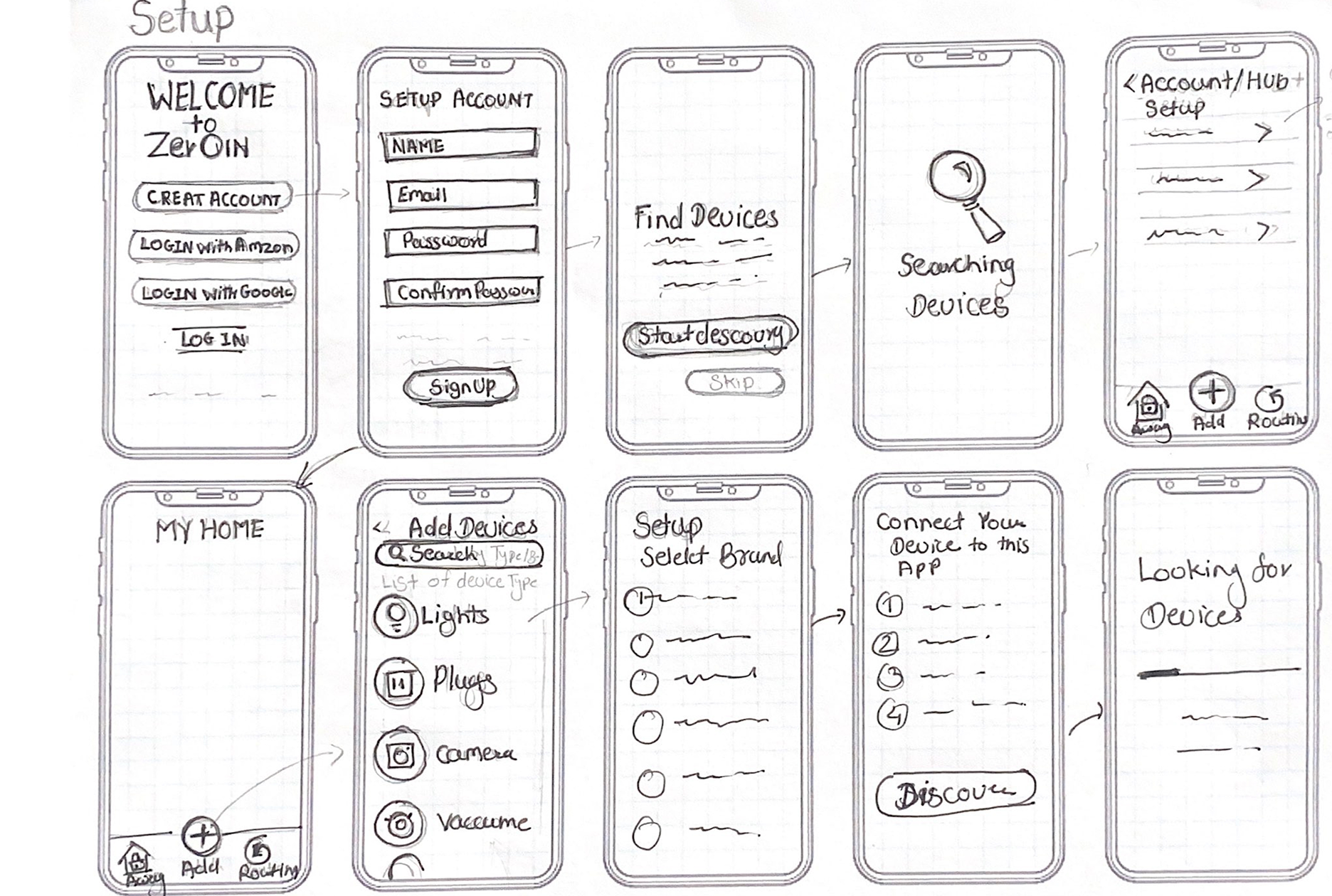
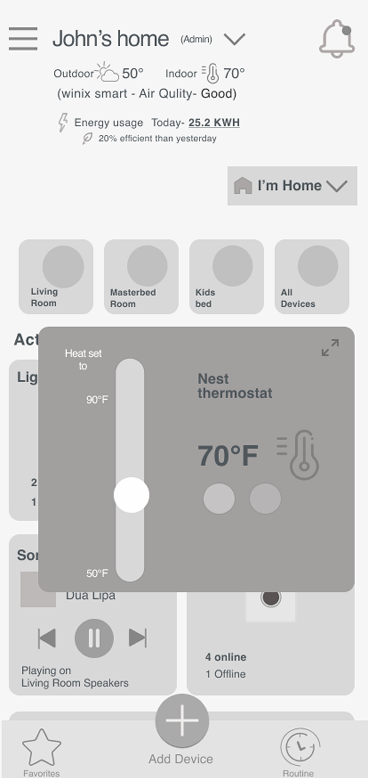
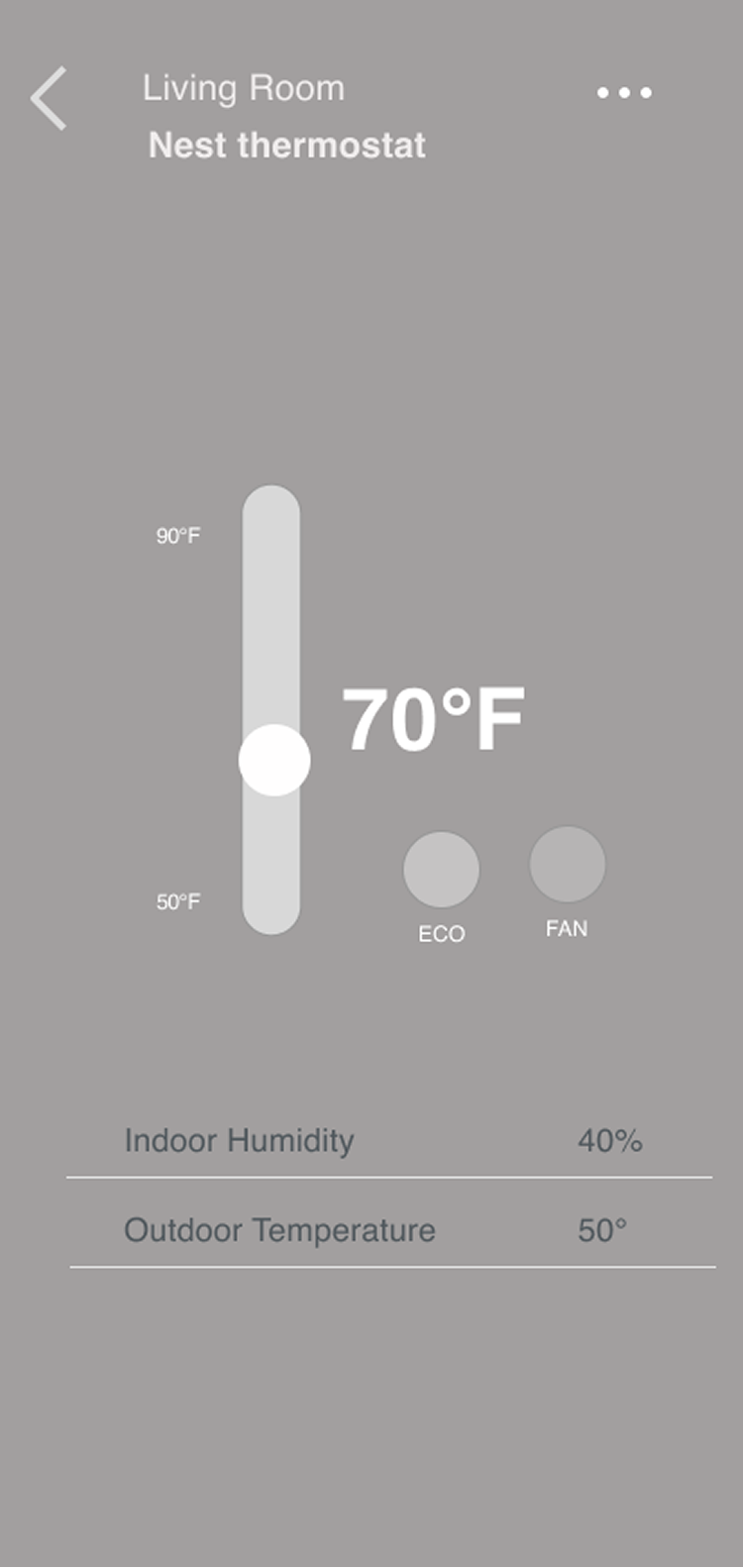
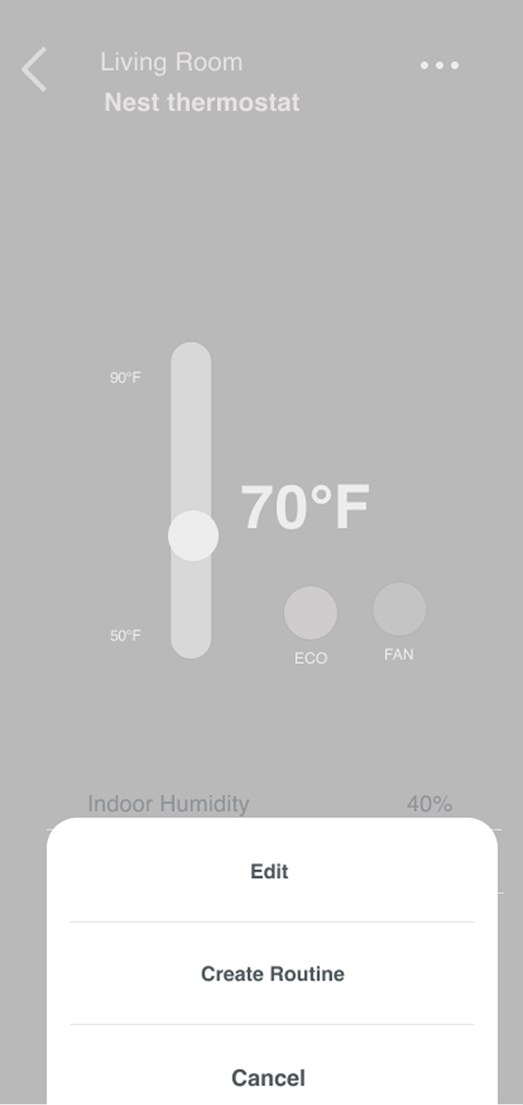
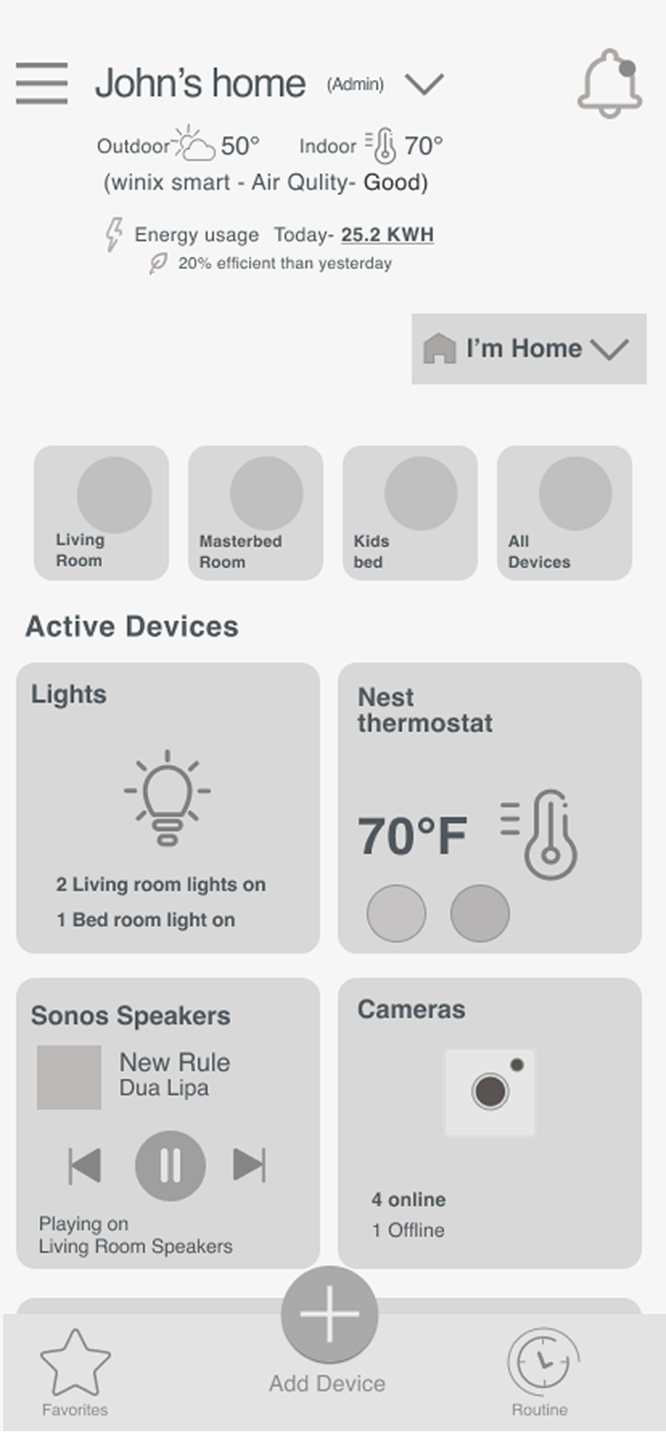
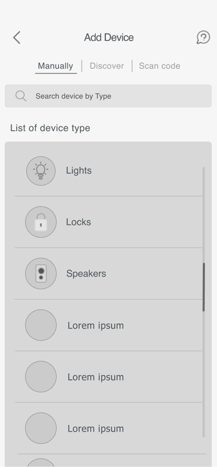
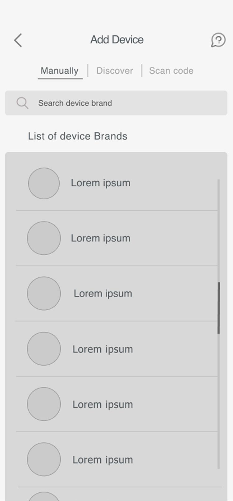
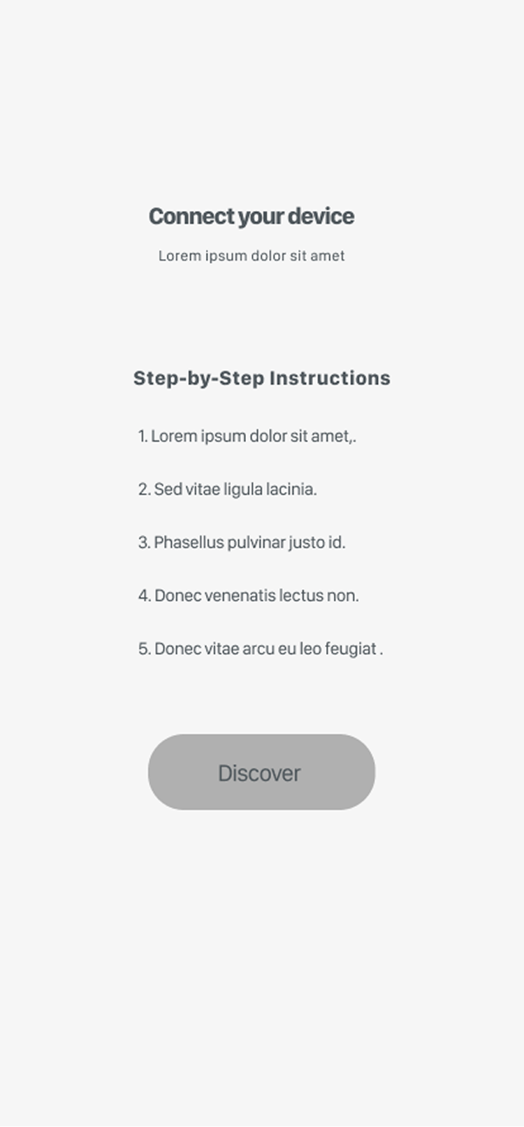
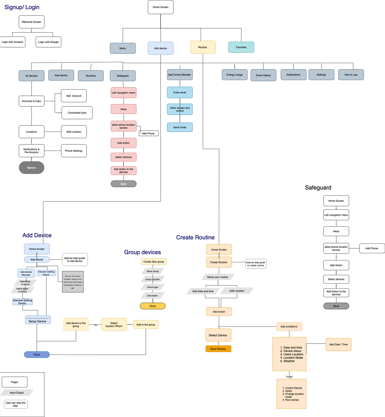
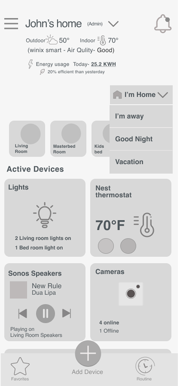
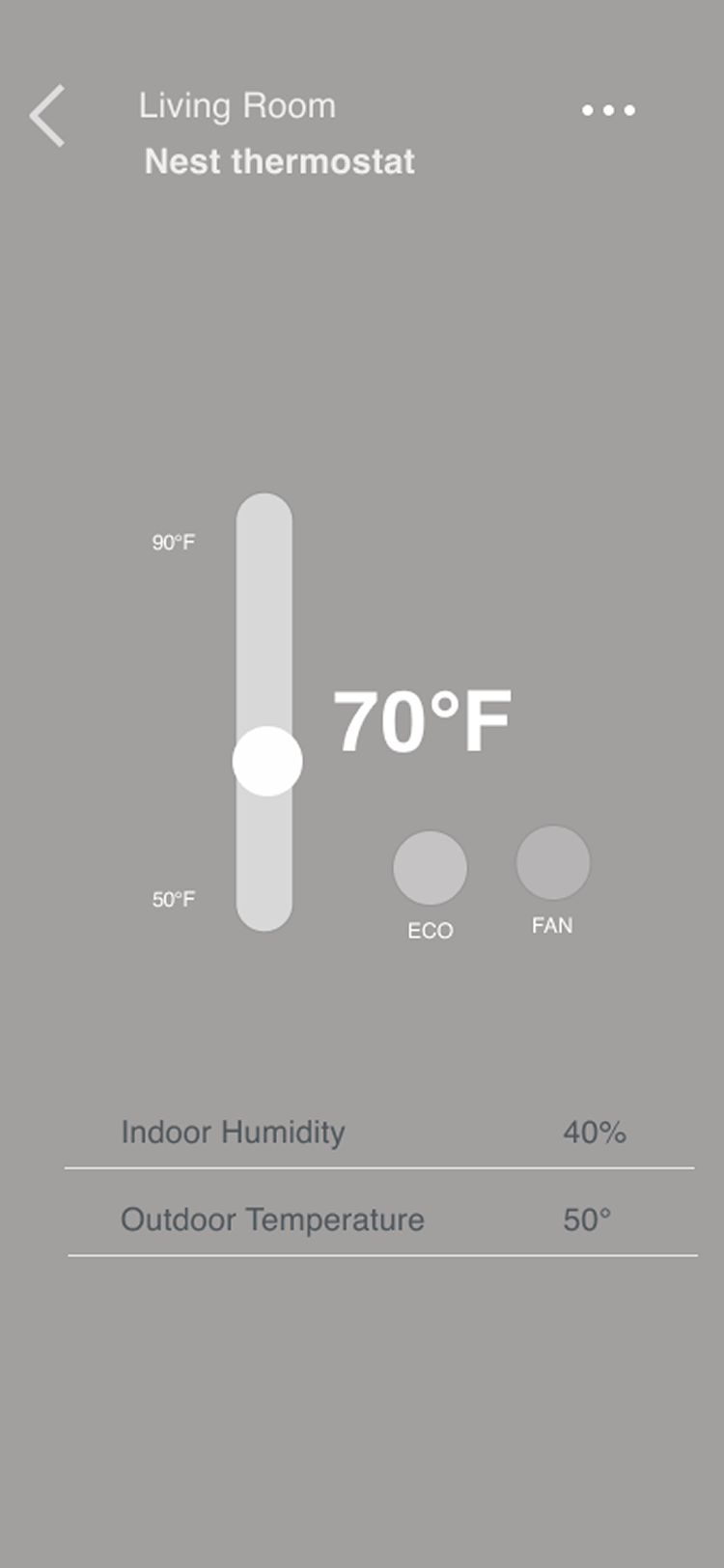
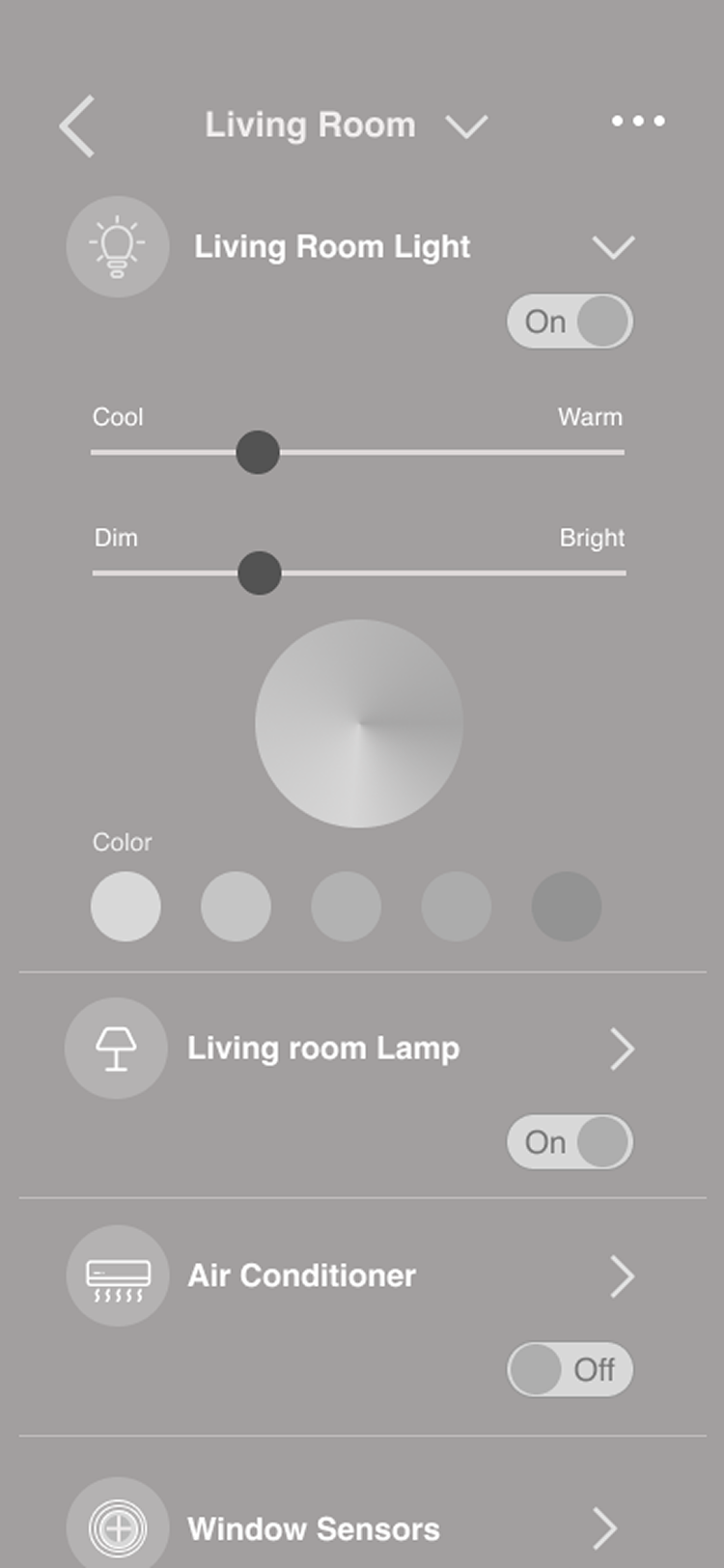
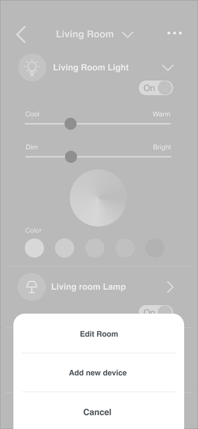
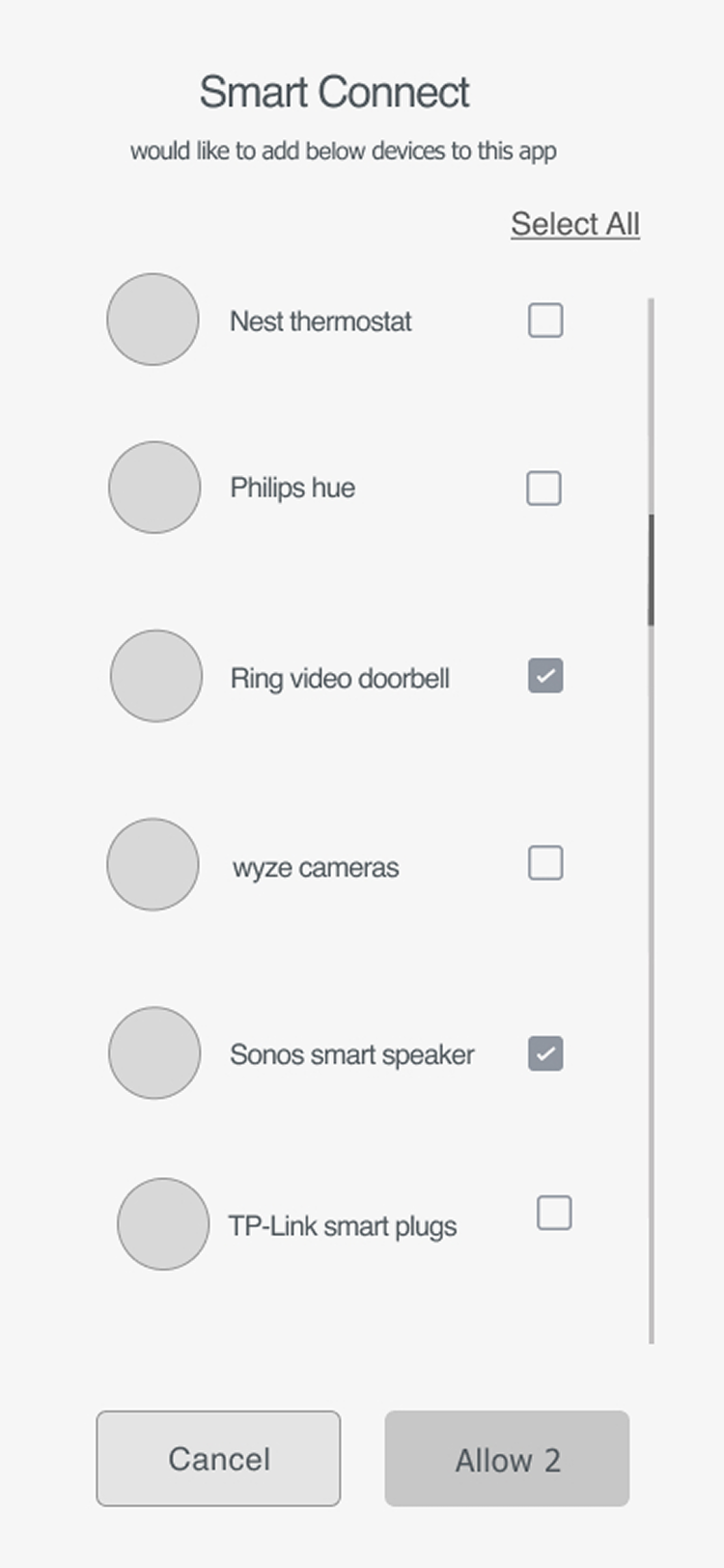
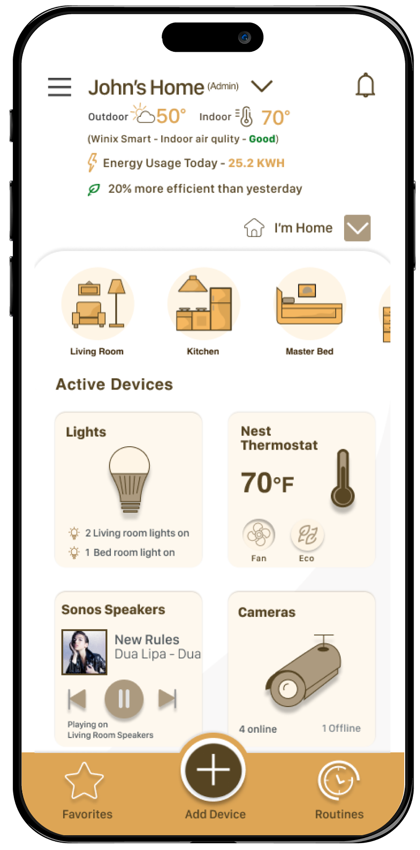
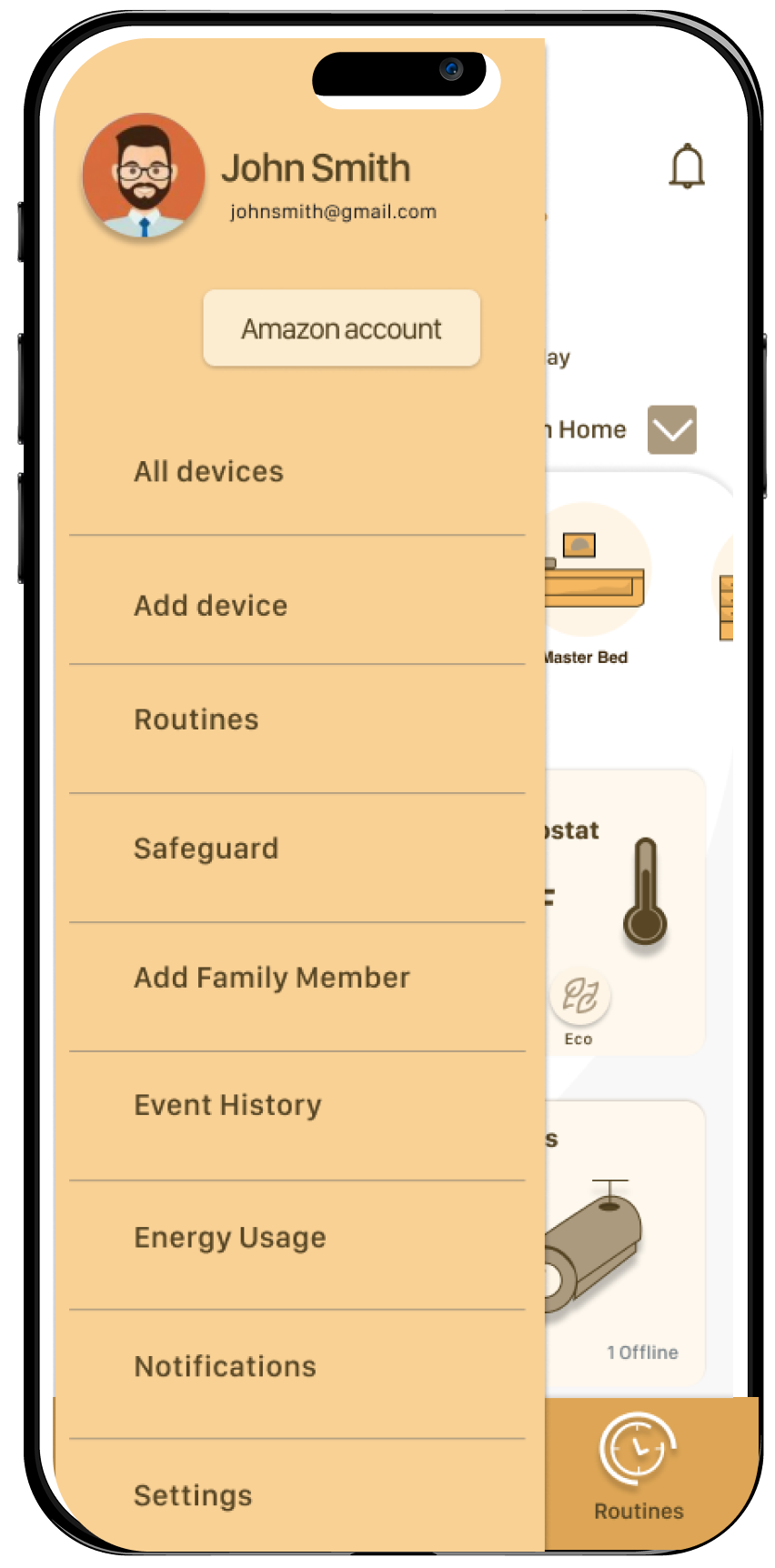
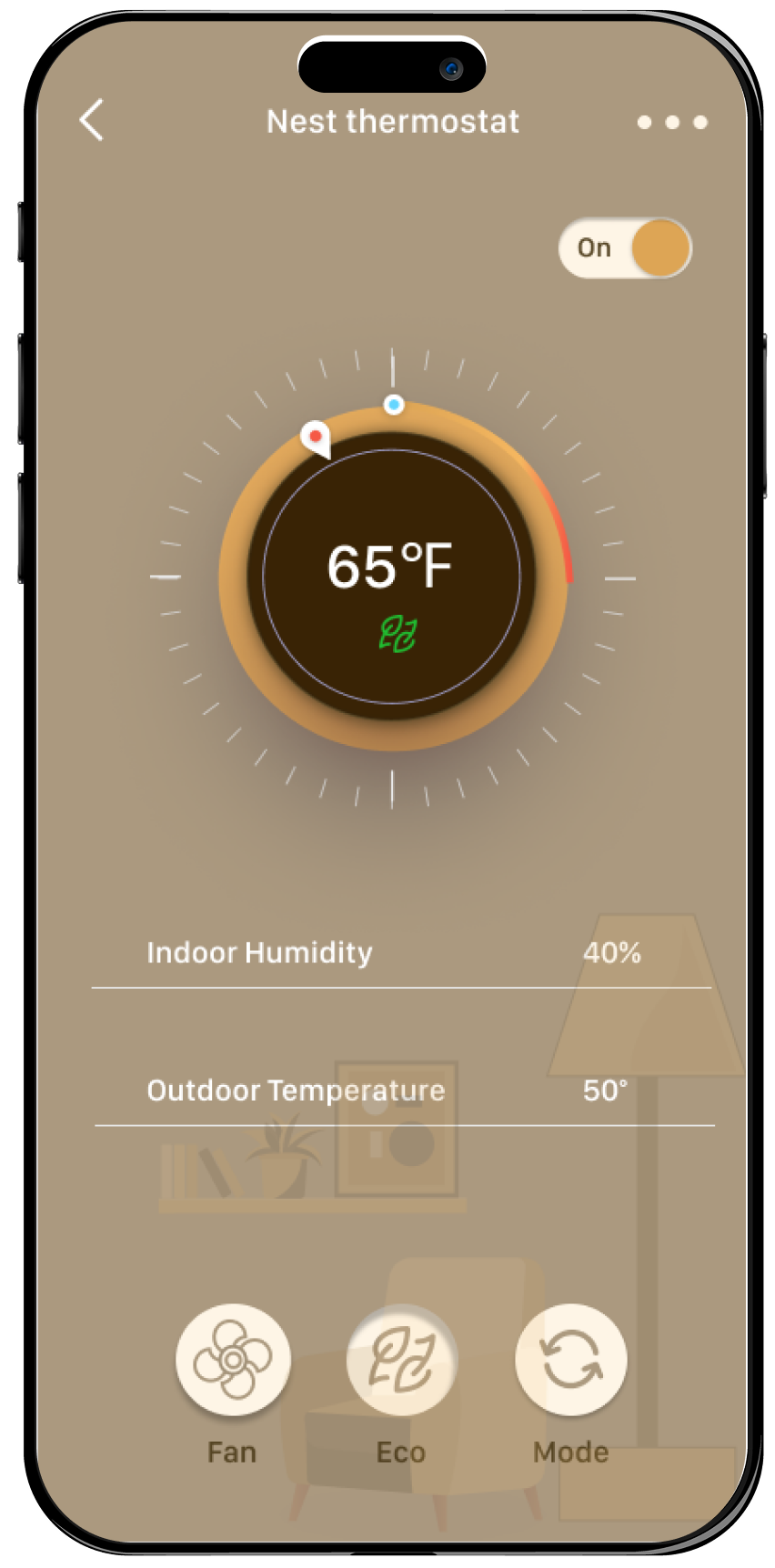
For the 'Smart Connect' user testing sessions I have done an unmoderated Remote Usability testing and moderated Usability testing with 8 people that fit into the app's target demographics. I have shared a Figma prototype link with the users. I was testing the Hi-fidelity 'Home screen' and wireframes for other screens.
I gave the user some introduction about the product. Users had to complete a few tasks like signing up, adding a new device, adding a member and creating a new routine, changing the temperature from the home screen and give their feedback. The observations and feedback were noted down, where the user stated that the app was easy to navigate with a simple and easy to use UI. Only minor struggles were found by the user and they were noted down to further improve the App interface.
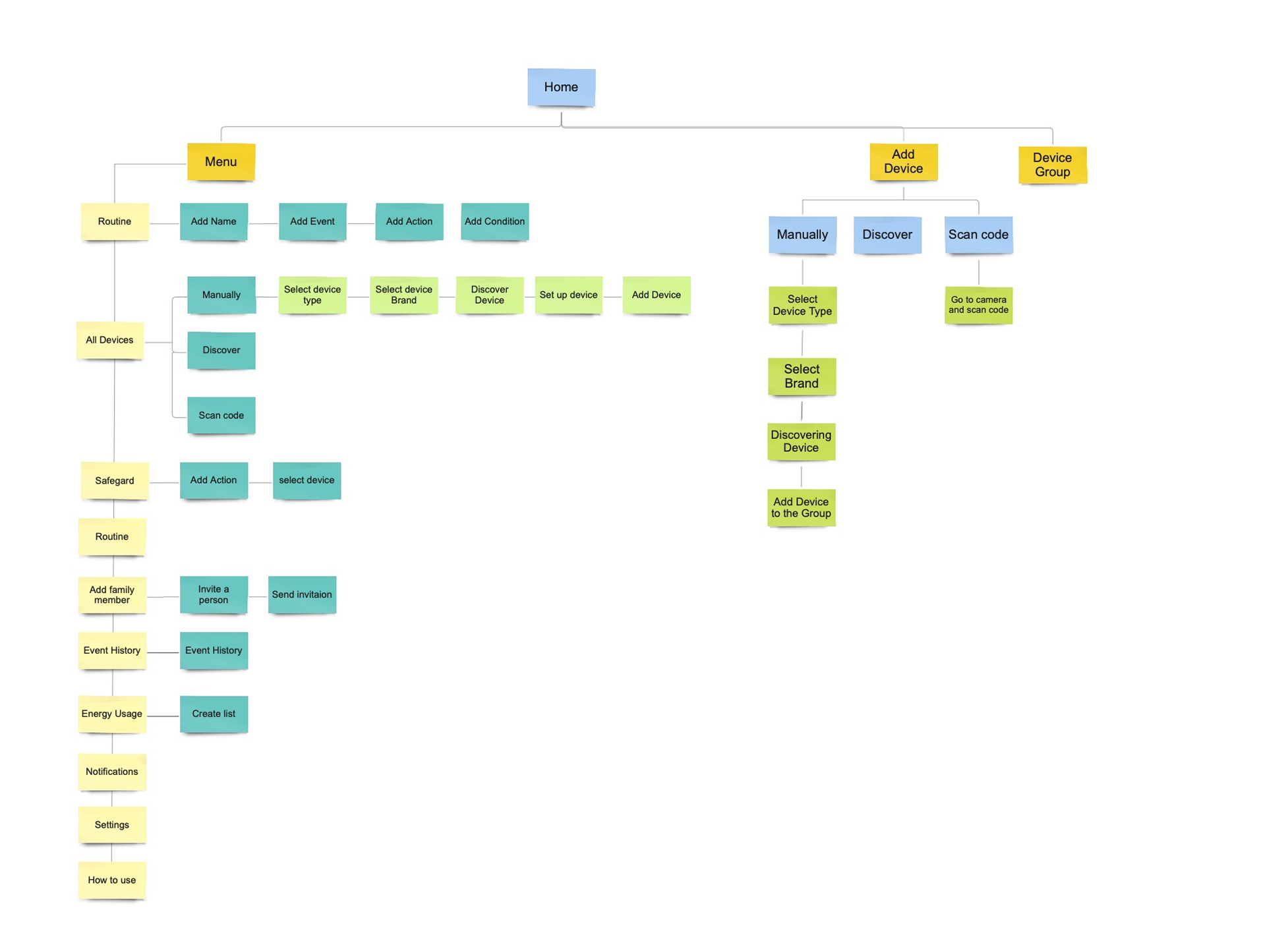
Key Findings & Iterations
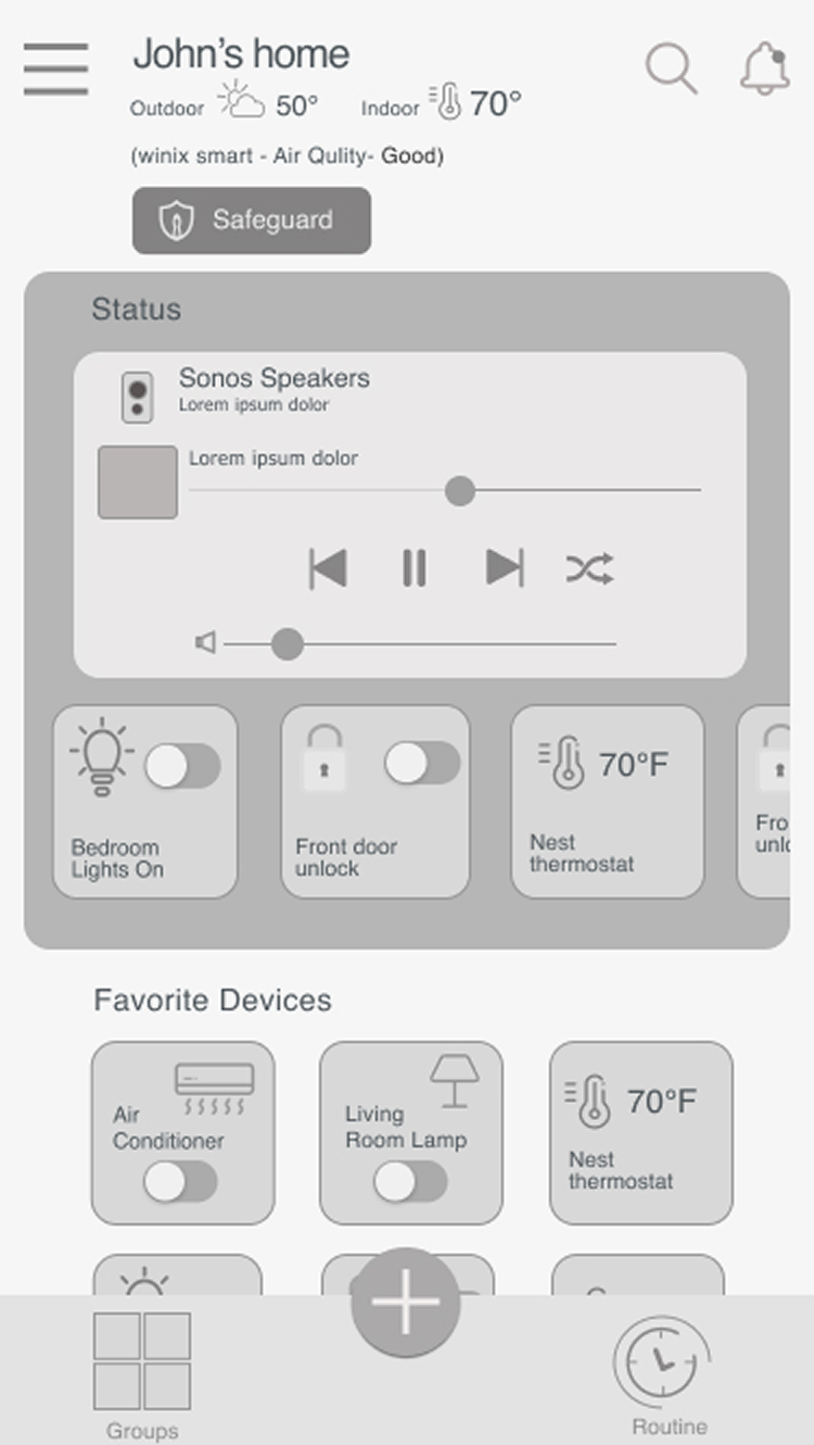
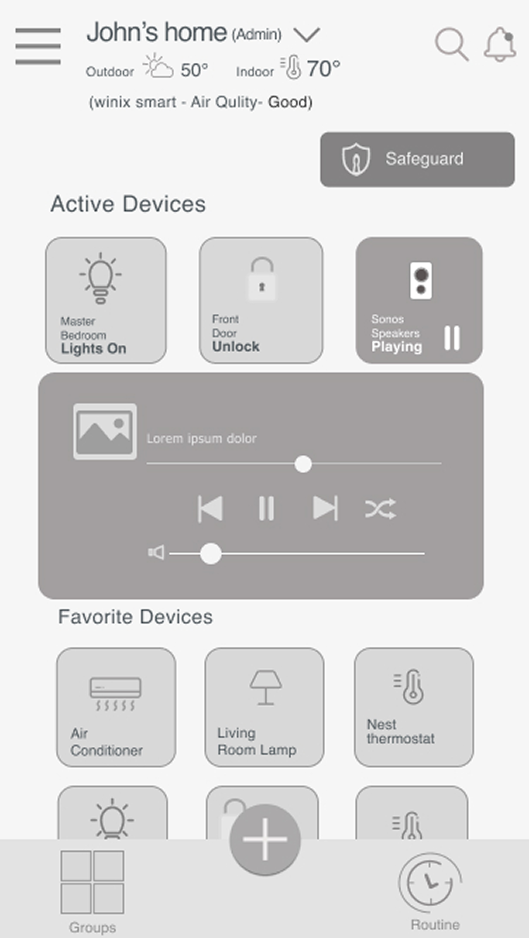
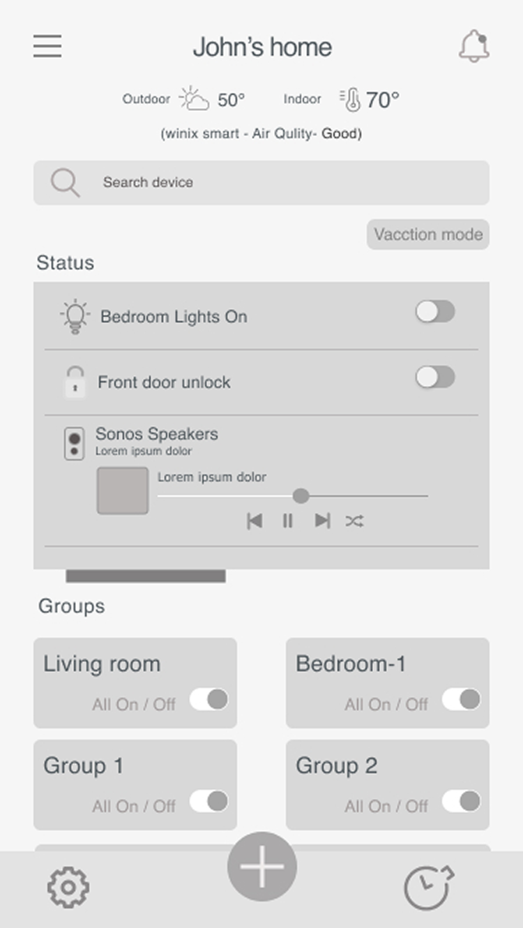
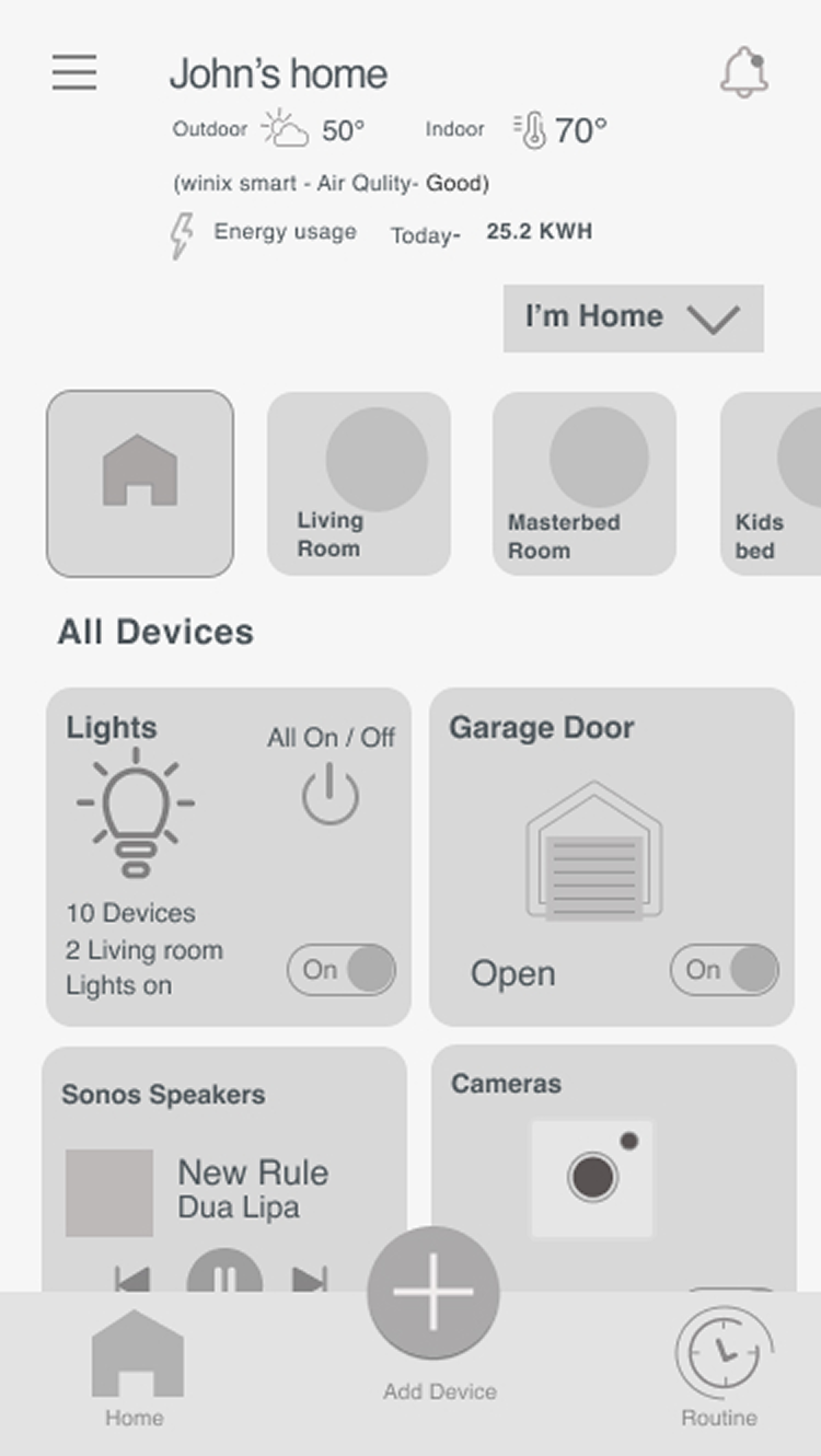
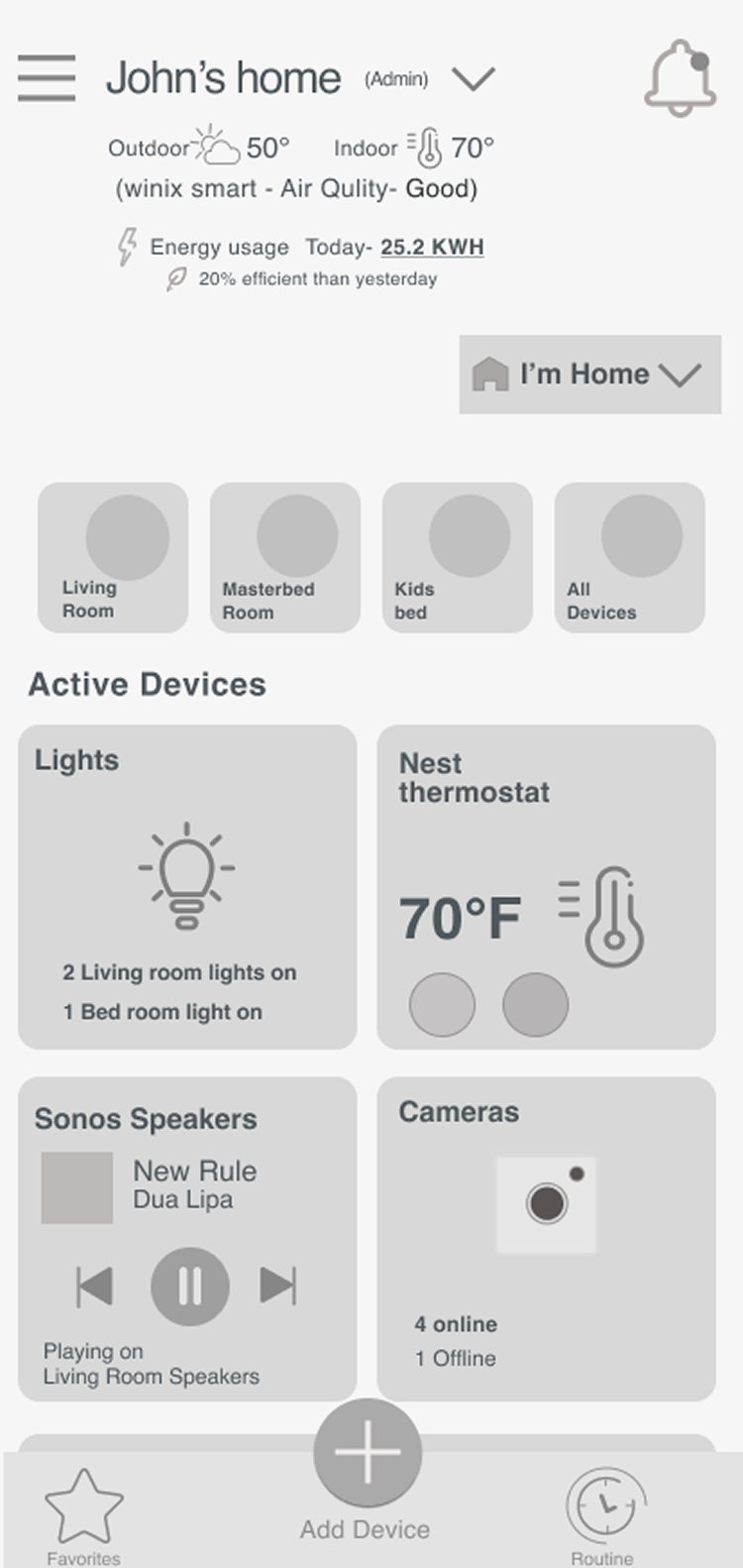
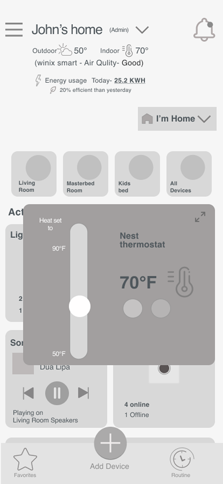
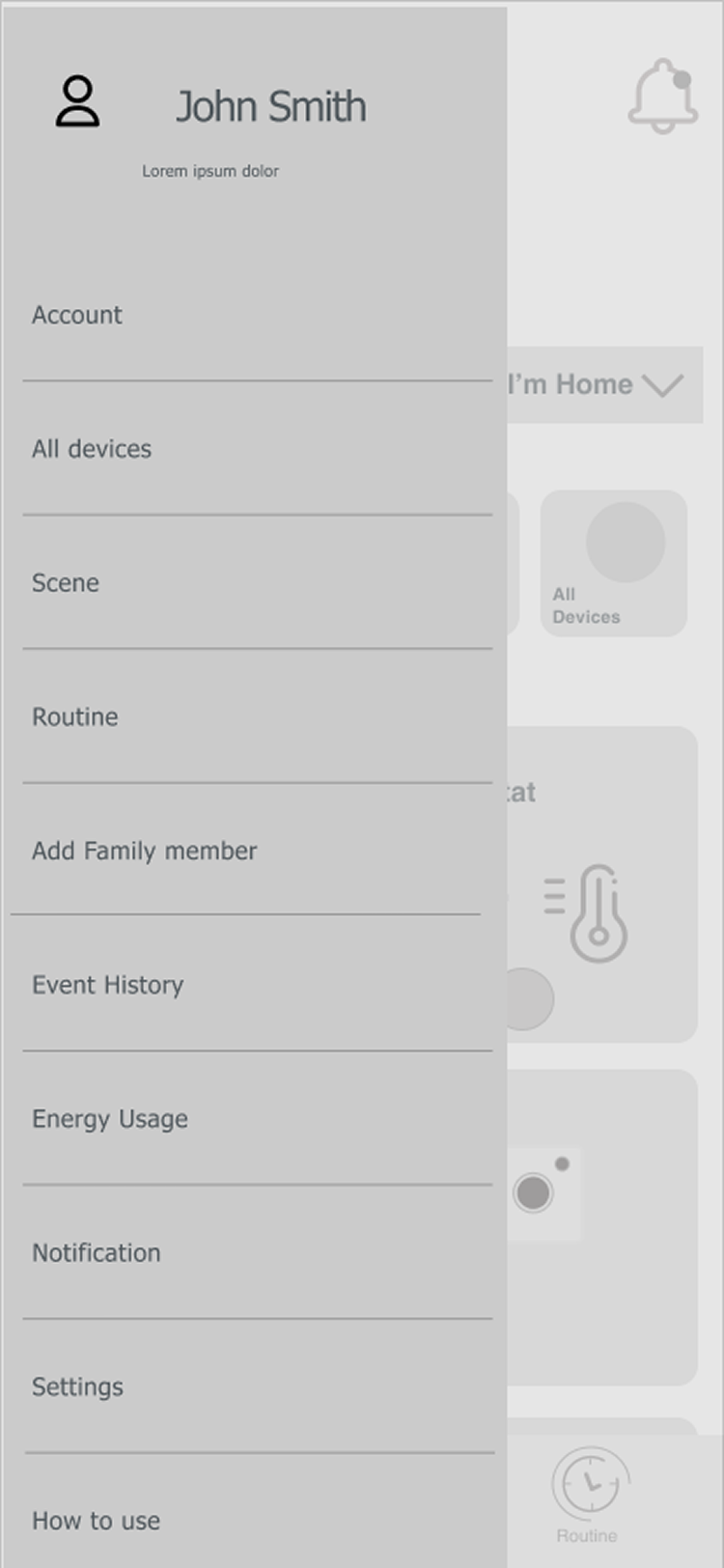
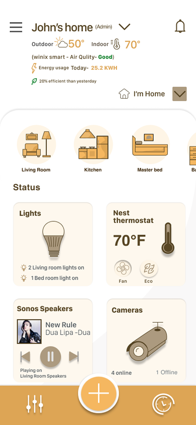
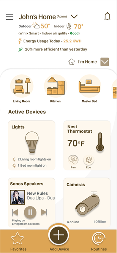
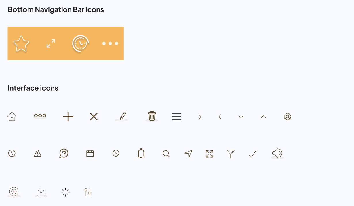
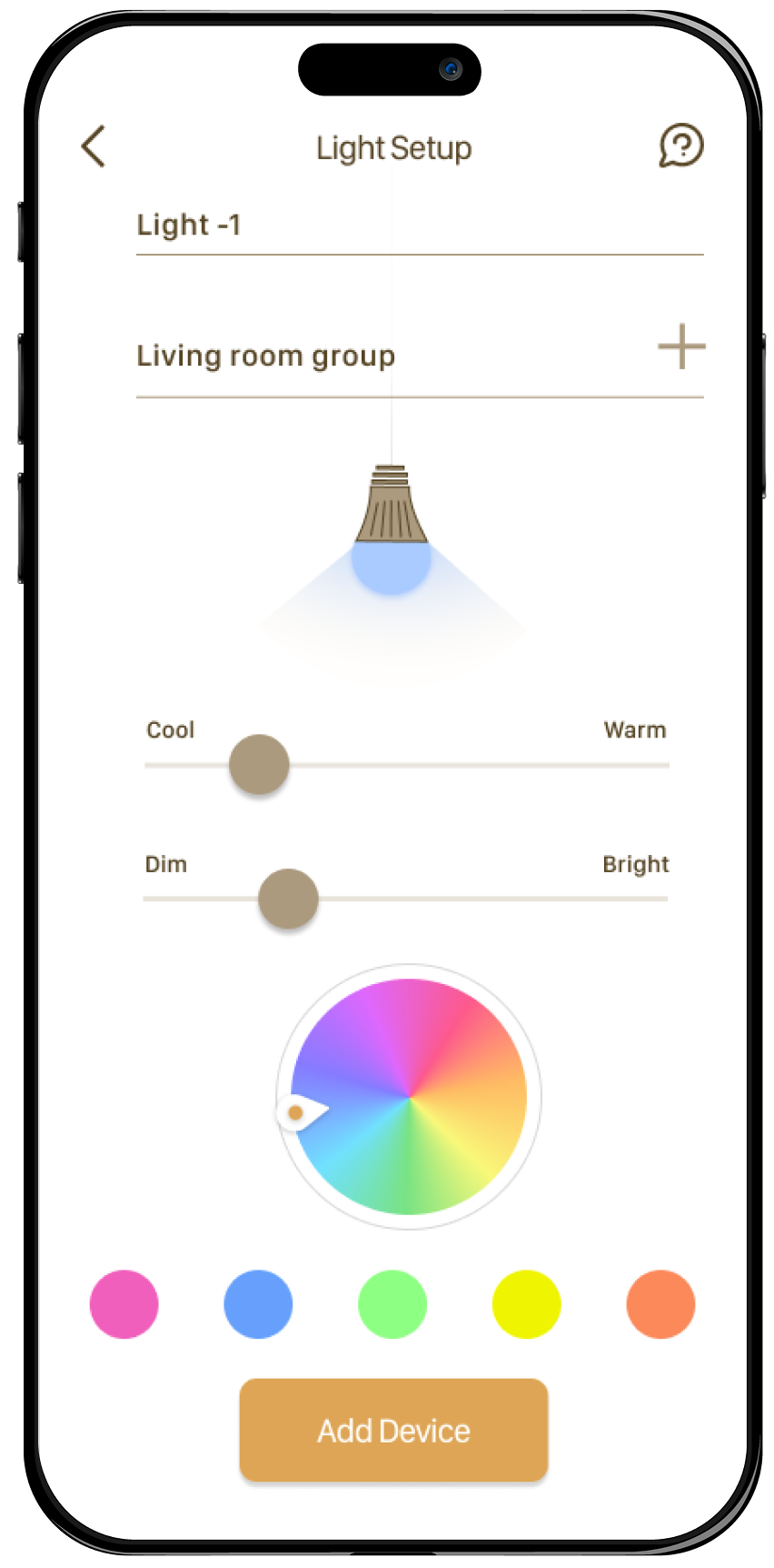
- Few users had a hard time figuring out the plus (Add device button), they tried to look in the hamburger menu for an add device link
- I had a recommendation that it would be easier to understand if I could add a text to the icon
- I have added an 'ADD DEVICE' link to the hamburger menu
- Changed the Add devices icon color so that it will be more visible
- Added labels to the icons